Following a relatively short-lived history here of breakneck developer-led boom and bust, the words “apartment” and “quality” never really stood a chance of co-existing in any meaningful way.
Thankfully, the tide is turning, and while we may have realised that good quality apartment design in our cities is not only desirable, but essential, it is a lesson that can only inform what we build tomorrow.
There remains a hangover from the boom years, and trying to knock something meaningful out of the poorly-designed apartment floorplans that remain is not for the faint-hearted.


The challenge of this transformation evolved from a desire to explore whether an internal layout suited to the specific needs of the client could be accommodated within the existing external envelope. In its original layout, this fourth-floor, two-bed apartment, simply did not function.
The clients had a need for only one bedroom, with the occasional requirement for guests to stay overnight, so the second bedroom functioned as a home office and doubled up as a room for music lessons.
Wasted space
The second bathroom was not used, and was earmarked as wasted space – the cardinal sin of apartment living. The position of the bathrooms in the plan meant the circulation within the apartment was not very efficient, with a lot of unusable space stretched out into the corridors which restrained the rooms that surrounded them. So, big problems to solve.
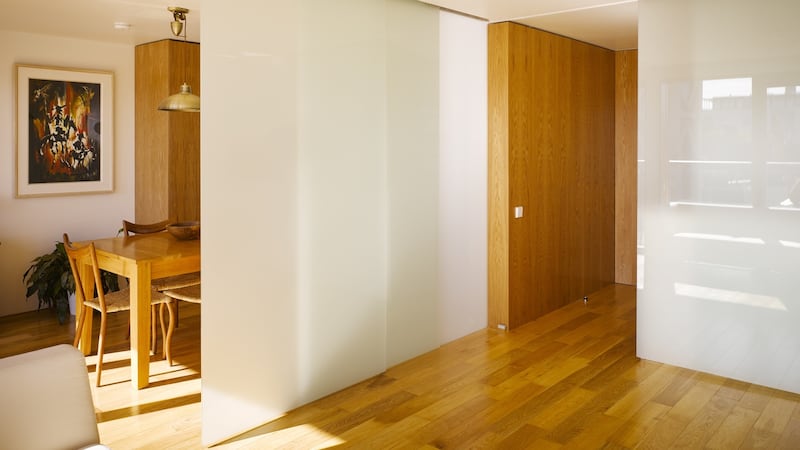
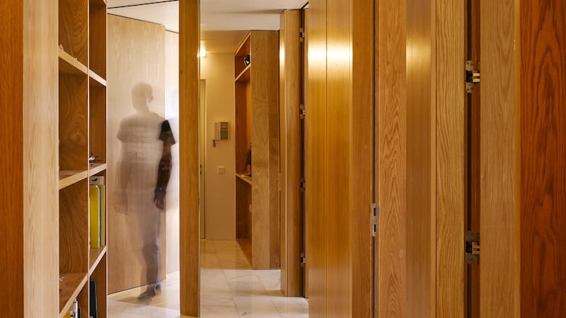
The resulting design by Eamon Peregrine Architect (eamonperegrine.ie) involved a complete remodelling of the apartment. The interior was stripped back to the concrete shell, including the removal of the two concrete bathroom pods. A series of oak veneered boxes of varying depth were used to divide the space and provide storage throughout the apartment.
Storage for books and a place for photos in the hallway and music room, a shelf by the front door, a walk-in wardrobe in the bedroom and a home office in the dining room were all built in.
Additional storage was provided in the bathroom for the washing machine and water cylinder and an existing separate locker in the basement of the building allowed for longer-term storage items.
Storage is a key consideration in all homes, but it is especially important in apartments, where every square inch needs to count.
Largely forgotten
The redesign is radical in its thinking, and its execution. The notion of “walls” is largely forgotten, and instead, these series of wooden boxes mark out what is defined as a room, and each one contains specific storage needs to the area it helps delineate.
The result is that instead of having one small storage room that would inevitably fill with junk, you carefully spread it out everywhere. This means everything has its place, which means you are far less likely to throw something into a dark room.
This concept effectively allowed the removal of the second bathroom and an existing store room, which in turn made it possible to create a large open plan living space.

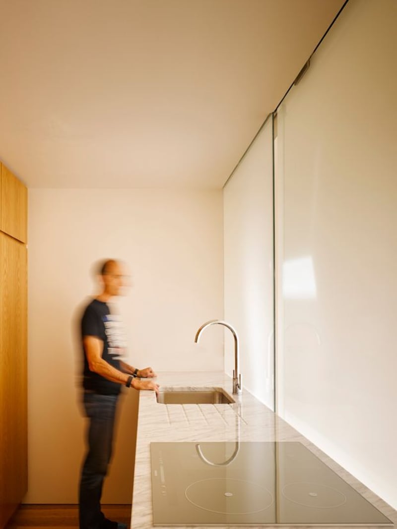
This space, containing the kitchen, living, dining and music room, was subdivided by opaque sliding glass screens. The circulation route through this space means each room can be used independently. The glass screens also allow light, borrowed from the dining and living room, into the windowless music room and kitchen. Ingenious.
An open mind is possibly the best design tool in the architect’s toolbox, and if the client can go along for the ride then it can lead a project somewhere unexpected. Breaking convention and turning logic on its head is sometimes the only way to get out of a tight space, and by prioritising function, storage, light and usable space, this apartment looks like it belongs in the future, and is no longer rooted in its own past.
- Declan O'Donnell is an architect and founding partner of ODKM Architects, and occasional television presenter


