What constitutes a healthy diet, and how best to communicate that message, varies from country to country, fed by cultural differences, developments in science and nutrition, and government policy.
When the Department of Health issued a revised version of Ireland's food pyramid in December 2016, vegetables and fruit replaced bread, pasta, cereals and rice as the foods we should be eating the most of – turning decades of dinners upside down.
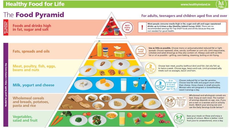
But what raised the most hackles was the replacement of a big block of butter in the original, 20-year-old graphic with a tiny, single-serve pat, the likes of which you might be served with a scone in a coffee shop.
Adding insult to injury, an accompanying information leaflet, issued by the department, made no mention at all of butter, and consumers were urged to “choose mono or polyunsaturated reduced-fat or light spreads”.
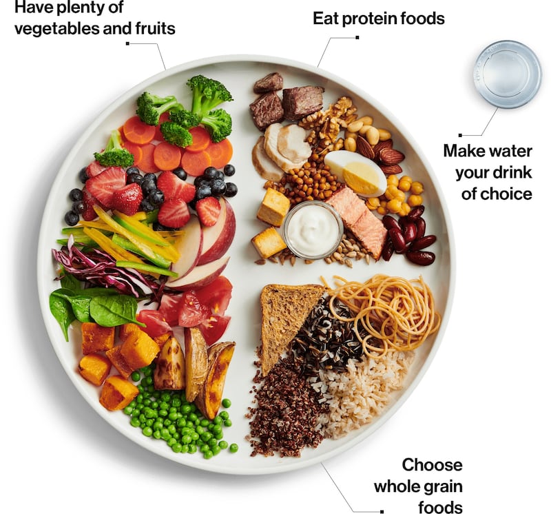
Using a graphic as a visual representation of what constitutes a balanced diet is a worldwide phenomenon, and it is just as likely to be divisive in India as in Ireland. Last week, Canada launched an updated food guide that completely omits milk, butter and cheese, amid concerns from farming groups. The new Canadian model leans heavily towards a plant-based diet, supplemented by whole grain foods and protein from a wide variety of sources.
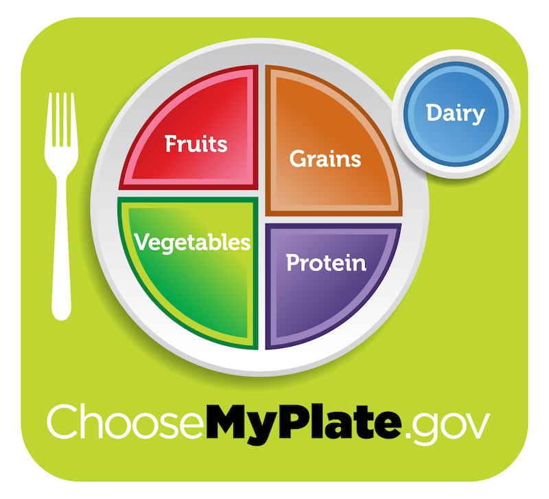
The new version of Canada’s Food Guide uses a dinner plate to illustrate what a balanced diet should look like, and in what proportions. This approach is also followed in the US, which got rid of the pyramid model and replaced it with MyPlate in 2011. The MyPlate graphic, while broadly similar to the Canadian one, has an extra element. There is a glass of milk sitting alongside the plate, in direct contrast to the Canadian instruction to “make water your drink of choice.”
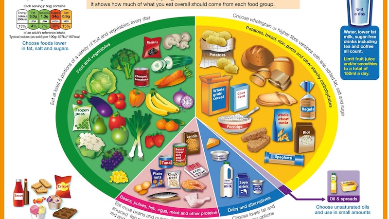
In the UK, a plate is also the symbol used for the Eatwell Guide, which includes five food groups, majoring in vegetables and fruit, with a significant amount of starchy carbohydrates, lesser amounts of protein and dairy, and a small quantity of oils and spreads, low-fat by preference.
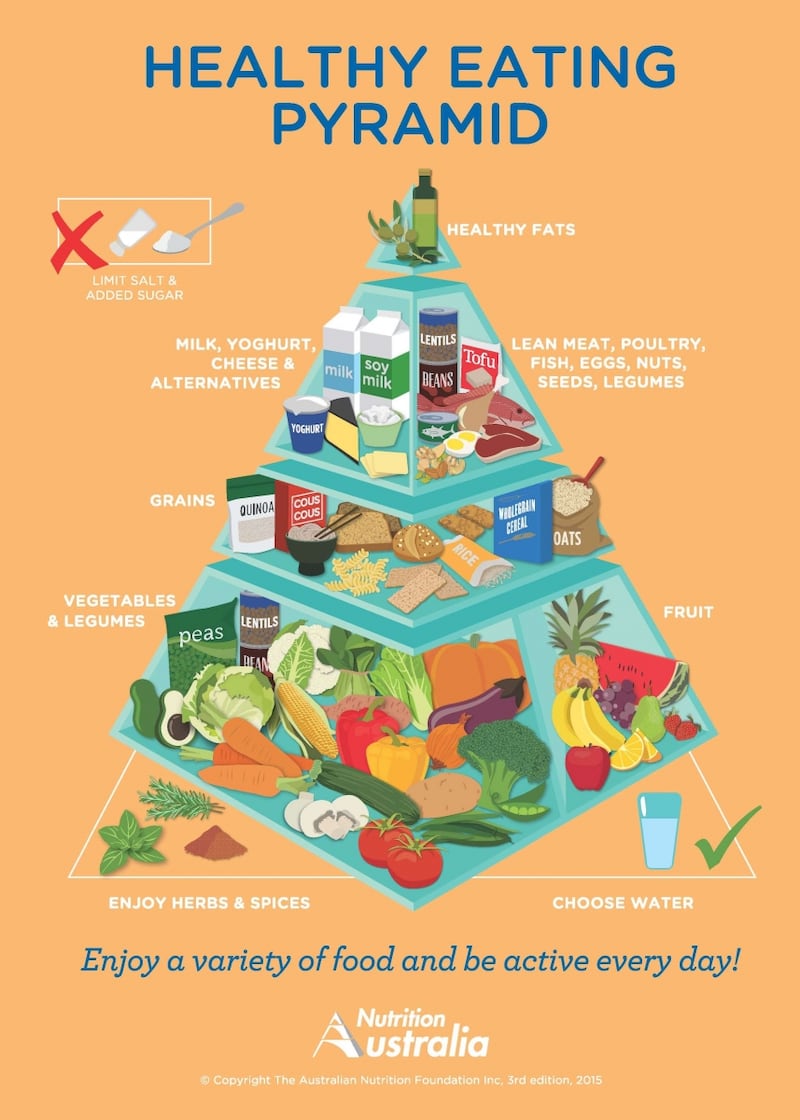
Australia, like Ireland, adopted the pyramid to illustrate its healthy eating guidelines. The foundations of this pyramid, last updated in 2015, are built on plant-based foods – vegetables and legumes, fruits, and grains, supplemented by dairy and a variety of proteins, with a drizzle of healthy fats on top. Sugar and salt are excluded.
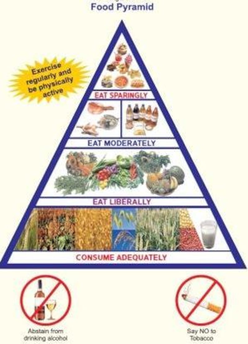
India’s food pyramid throws up an interesting observation. Right at the base of the pyramid, to be consumed “adequately” are a variety of grains, and alongside, a glass of milk. India is among the world’s largest producers of milk, and unlike in Canada, drinking it is actively encouraged.
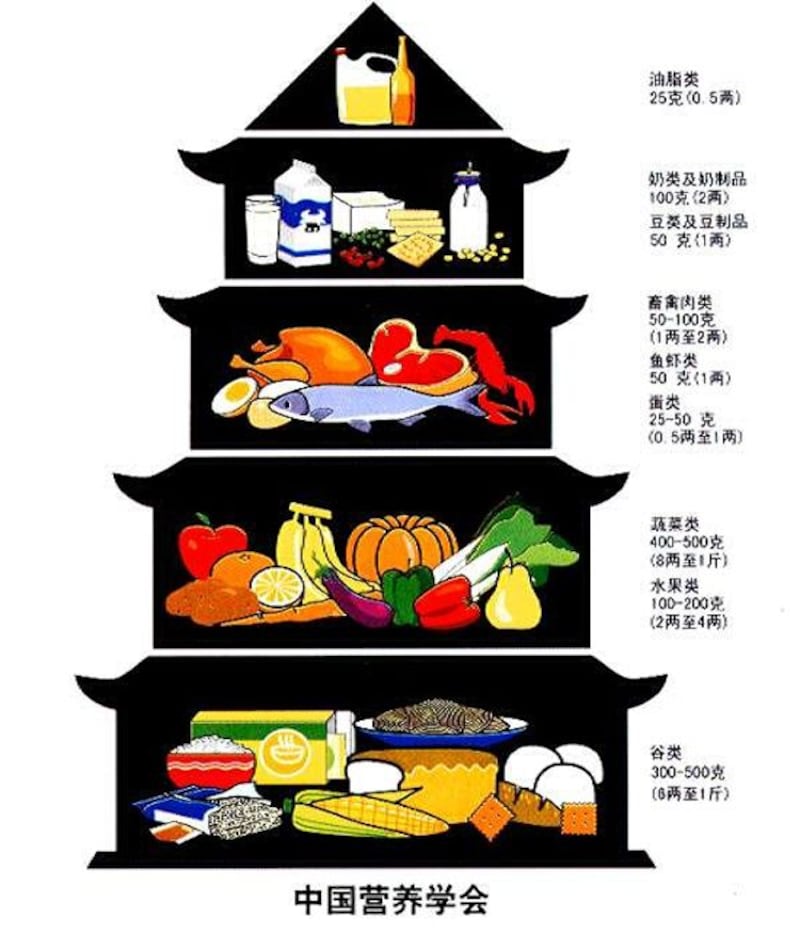
In China, a jaunty pagoda takes the place of the food pyramid. In the 2016 version, cereals, tubers and legumes are the main food group, followed by fruit and veg. Lean meat, fish and eggs follow those, with a smaller space reserved for milk and dairy, soybeans and nuts. Cooking oil and salt occupy the apex of the pyramid.

In Japan, the pyramid is turned on its head and becomes a spinning top. Rice, bread, noodles and pasta are the dominant food group here, with five to seven servings of these grain foods recommended daily. Vegetables are next in volume in this graphic, introduced in 2005 and revised in 2010, followed by protein in the form of meat, fish, egg and soya beans. At the pointy end of the spinning top, small spaces are reserved for fruit (two servings a day), and for milk and milk products (also two a day).


