Merging drink and design is not a new phenomenon; beverage marketers love to invest in clever and fun packaging. Who doesn’t have a collectable bottle or two somewhere on their shelves?
But with the explosion in popularity of craft drinks in recent years, design focus has shifted somewhat. Artisan makers and producers don’t have the same budgets or freedom as bigger brands to custom design packaging, so inventive label design and storytelling have become the marketing trick du jour.
It’s one of the savviest ways to get your product to stand out on shelves, and when you get it right it may even transform your business.
Shane Murphy, wine director at Findlater & Co wine merchants, says winemakers have always been keenly aware of how simple branding can sell their wine, and their story.
Each of the men on the Matsu labels links into the vine, where the wine is cultivated from, and the time that it spends ageing
“Traditionally they all tried to emulate the great chateaus. They might add a sketch of rolling hills, but what you’ve got now is things being more influenced by the natural wine movement, becoming more punk, different, modern, minimal and interesting.”
One story he tells that encapsulates how intuitive design can change a business is that of Matsu, a Spanish winery based in Toro in the northwest, an area not well known for wine.
The winemakers knew they had something good, and worked with designers Moruba to come up with a trilogy of bottles using striking images of men they know who have devoted their lives to making wine.
“Each of the men links into the vine, where the wine is cultivated from, and the time that it spends ageing,” Murphy explains.
The young face, El Pícaro (The Rogue), is on the label for the youngest wine, a Tempranillo from vineyards that are 50 to 70 years old. A middle aged man is on the label for El Recio (The Strong), from 90-year-old vineyards, and an elderly man for El Viejo (The Old), from vineyards that are more than a century old.
Murphy says Matsu is the big story in Spanish wine at the moment because of the success it has made of the whole area.
“Those guys are now buying half the production of the region, and they are getting the farmers to farm it biodynamically, and they are paying them more for their fruit then they were getting previously.”
Murphy has noticed newer wine companies jumping on design ideas like this, “especially as they battle it out to convert craft beer drinkers, who have already had schooling in provenance or in style”.
Rory Craig of Station To Station Wine, a new Dublin-based online wine shop, is all too aware of how design can affect sales. While he doesn’t choose wine based on the labels – “you can’t put lipstick on a pig” – he does cleverly market wines that have more innovative labelling.
A recent mixed box he put together is called “Does Banksy Drink Wine?”, an eclectic selection of bottles chosen for their “awesome labels”.
It includes Cellar del Roure Vermell, a Valencian red wine with a white and red label designed by Dani Nebot, one of Spain’s best-known graphic designers; 16 Stops Shiraz from Australia, which has a map on its label illustrating the 16 stops of the Willanga Railway line used to transport the slate that built Adelaide; and Fabien Jouves’ obscenely named You F**k My Wine from Cahors in southwest France, “which has to be seen to be believed”.
Beavertown broke the mould, making their cans more about the art that was on them than the name of the beer
It’s nothing new, Craig says, for winemakers to collaborate with artists.
“In the 1940s Mouton Rothschild” – the renowned chateau in the Médoc region of Bordeaux – “began selecting artists to create original pieces for their Claret. Dalí, Bacon and Warhol have all contributed.”
Back then it may have been more of a passion project for winemakers, or a simple love of art, but more recently Craig has noticed how established winemakers are using art and creative labelling to make themselves relevant or talked about again.
“In Piedmont [in northwest Italy] last month, I was meeting some producers that I have worked with for years, and I witnessed the winemaker at Cantina Rizza hand-paint some labels for magnums of Barbaresco on the spot. He will do this live at a dinner in Australia later this year. In a region that is steeped in tradition and dominated by the status quo, these young winemakers have established a unique selling point for themselves through their innovative design.”

One of Craig’s favourite wine label success stories is that of artist turned winemaker Bibi Graetz, and his Soffocone di Vincigliata wine. The label depicts a sexual act, which resulted in it being banned in America, where the law strictly prohibits any sexual imagery.
“Bibi is now cult a winemaker whose top wines are some of the only consistent performers on the Live Ex wine stock exchange,” Craig says. “There is no question that the buzz surrounding his sometimes controversial labels established his marketing edge, and helped make them some of the most collectable wines on the planet.
Craft beer fridges in off licences around Ireland clearly display how this burgeoning industry is successfully using design for storytelling. Susan Boyle, a drinks consultant, artist and PhD beverage researcher at Technological University Dublin cites the Beavertown brewery in London as the first she recalls doing this well.
From the start they used one designer, Nick Dwyer, to create unique labels for each beer. Skulls and skeletons, which could have been a bit blokey, were fused with their signature bright pop colours, resulting in eye-catching accessible designs that command attention.
“Beavertown broke the mould in relation to that very obvious iconography [of the big beer brands], making their cans more about the art that was on them than the name. With the heavily recognisable macro beer brands you see one letter of the font and you know what it is. It is a reaction against that, to find an aesthetic that matches the style of the brewery.”
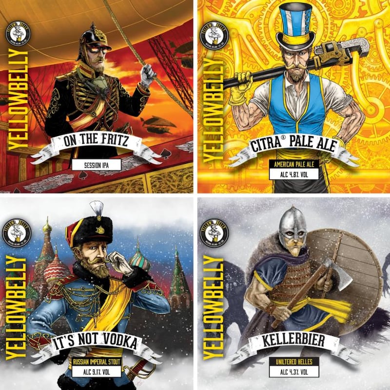
In Ireland, YellowBelly brewery in Co Wexford has impressed her with its graphic novel-style illustrations of the YellowBelly character in different worlds on each label, created by their in-house designer Paul Reck. The brand has even released a comic book series called YellowBelly Tales.
“They’ve really thought about design as a complete visual story. This swashbuckling ‘YellowBelly’ character is the embodiment of the beer. It tells people where it’s from without blatantly saying ‘Hello, I am this brewery’. It’s more sophisticated than that,” Dwyer says. (“Yellow Bellies” is the local nickname for Wexford hurlers).
The coffee industry seems to only just be turning its attention to packaging design from an aesthetic or storytelling perspective. Up to recently artisan products were similarly packaged in smart, minimal brown paper bags. Tom Stafford from Vice Coffee in Dublin, who retails coffee bags in his café, is happy to see producers start to mix things up.
“We 100 per cent get in packaging because it looks good, and it’s different.” He says it is simple; coloured bags sell better.
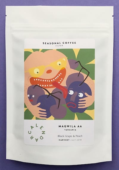
Zarah Lawless from Galway-based roasters Calendar Coffee has fully embraced colour for her company’s packaging. Inspired by the craft beer industry, they worked with Cardiff-based artist Cadi Lane to design unique labels for each new coffee release.
“From a financial point of view, for a startup it was one of our biggest costs. It makes us a bit more expensive. But it was what we really wanted to do.”
They sent their blend’s tasting notes to Cadi, highlighted what flavours were most dominant. The designer came back with illustrations that included lots of fruit in drag, with hairy legs and lots of eye-catching bright colours.
“I didn’t realise it would have such an impact on people until we were doing it,” Lawless says, emphasising how the illustrations have helped customers remember which blend is which. “People are coming in now and asking for the chocolate one, or the orange one.”
Lawless has no doubt the design expense has been worth it. “It’s been the best investment for us.”
The company now export about 40 per cent of its produce, which she attributes in a large part to the attractive unusual packaging. “It got us noticed. I think it’s down to the bags. And the coffee, of course; the coffee has to stack up.”