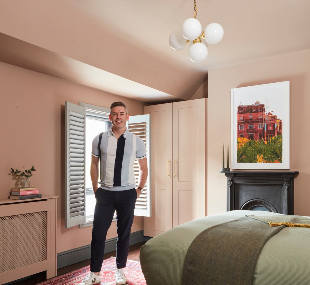

“I’m sorry I didn’t do it sooner,” says Darran Heaney, of the dramatic colour change in the principal bedroom of the Dublin 7 home he shares with his husband, Eoin Callaghan.
When they bought their late Victorian home in 2016 it had period features such as high ceilings, good square rooms and plenty of natural light but was in need of complete refurbishment.
If his home looks first rate now, that’s because it is. His father, a successful builder, and his brother, a fully-qualified carpenter, offered expertise and labour to help execute all his ideas.
Eoin’s family also helped by supplying contacts for good plasterers. The finish on the walls throughout is first rate and it is this kind of surface on which fresh coats of paint look best.
READ MORE


By day, Heaney is head of engagement and innovation at DCU’s Anti-Bullying Centre. In his free time, he’s an interiors hobbyist who has already worked through many shades on the colour wheel on the walls of the Phibsborough house and charts it and other inspiration on his Instagram account, @oldvictoriannew. “It’s a sort of antidote to my day job, a creative outlet that offers escape,” he explains.

Its decor is a mix of antique finds and contemporary furnishings. When abroad he likes to bring back souvenirs that become part of his home decor. The biggest thing he has managed to bring home in his hand luggage is a flat-weave rug from a city break to Valencia, Spain’s design capital.
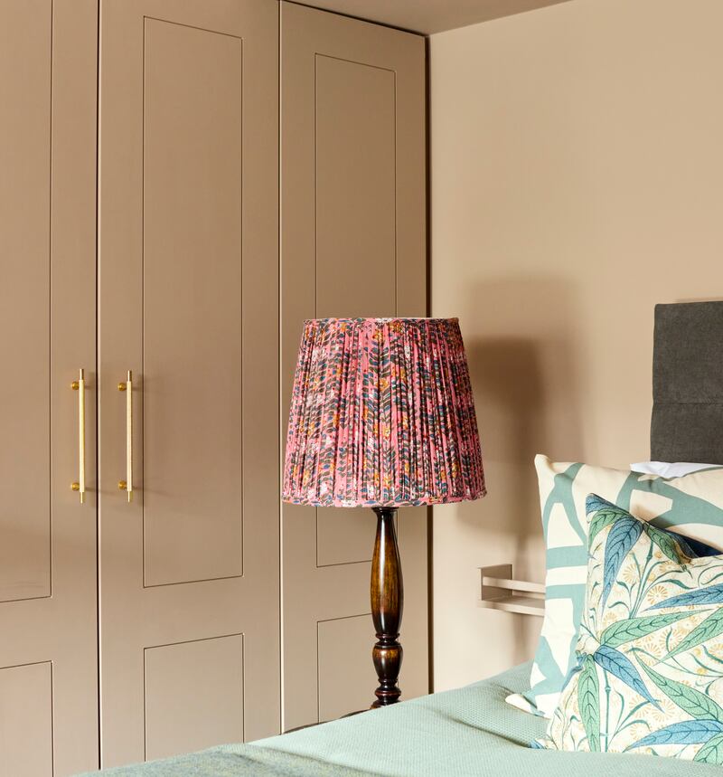
“I love old things and markets. I wasn’t leaving it behind,” he says. It now graces the bedroom floor and was the inspiration for the paint scheme. That and the fabric in a lampshade that he sewed at the kitchen table using a remnant.
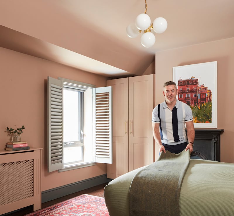
The house, he says, has been a work in progress. The kitchen units, for example, were fitted only last December. “I’m gradually moving upstairs. I enjoy using the house as a canvas and natural wear and tear means I like to refresh a room every two or three years. Painted a dark midnight blue, the bedroom hadn’t been done since before Covid. It was a serene shade that worked in a space with a small window where natural light is not plentiful,” he says. Blackout blinds and plantation-style shutters also aided a deep sleep. But he wanted to switch up the slumber set-up, banishing the dark and moody colours for a seasonal refresh using new hues.
He worked with the Dulux Heritage range, a timeless, luxury colour palette which offered him a selection of fittingly classic hues with a modern twist.
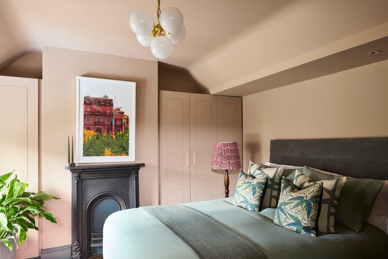
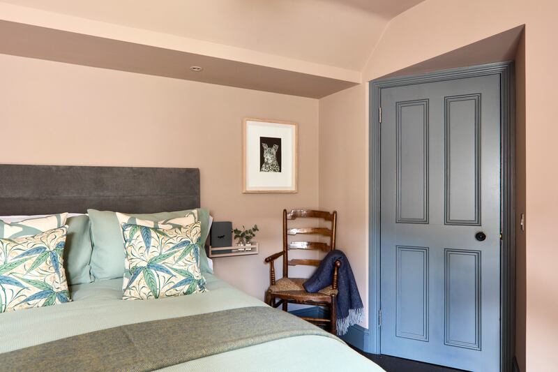
The walls and ceiling now wear Mid Umber, an earthy tone with hints of warm pink to deliver a sanctuary-like space that feels serene and restful, exactly the mood you want in a bedroom. It’s a very modern colour that works within the period setting. Walls and ceiling, what Heaney calls the fifth wall, wear two coats of the colour to achieve the rich finish.
A contrasting tone, Forest Grey, in an eggshell finish, is on the woodwork, skirting, door and plantation-style shutters.
“I’ve always been drawn to earthy warm tones and like colours that complement each other as you move around the house. I used the tones in my wardrobe to help me make my paint selection as you tend to gravitate towards certain shades that suit you. My wardrobe is full of navy blues, warm browns and earthy greens. My clothes match my walls.”
Dulux Heritage is designed using rich pigments and is already grouped into tones that contrast or complement each other. You can play with ideas online at the Dulux Heritage website, where you can select your paint by tonal palettes or by colour group.

But colour in real life behaves differently to how you see colour on a screen, he explains. “That’s why testers are key. It takes me time to make a final decision. I paint large A2 sheets of card and affix them to the walls and leave them there for a few days, moving each on to different walls to see how the light affects it and how it behaves under artificial light. It’s the only way to see how the colour will appear in your home.”
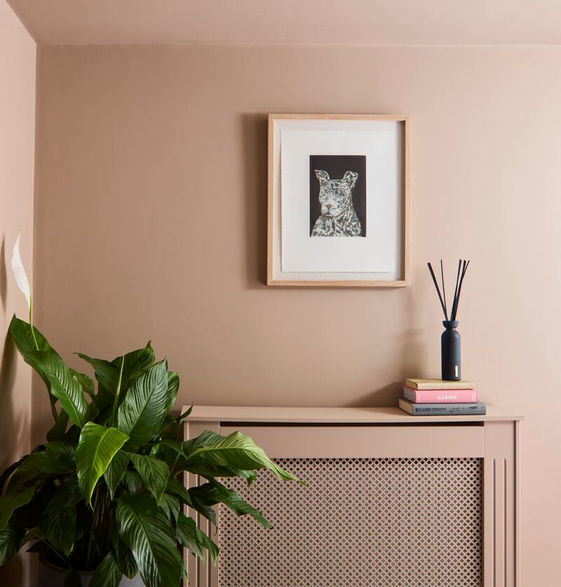
He had worked with the range before in his kitchen, where walls are painted in Setting Stone. “There’s a lot of depth to the pigmentation, it complements the exposed brick feature wall and feels modern – it doesn’t feel like you’re walking into a stately home.” It’s also nice to apply, he says.
He has also made many mistakes. “When we first moved in, I was obsessed by a teal green that I saw on Instagram. I was trying to replicate what I loved in someone else’s home and regretted it the minute I applied the paint.”
The difference is that he isn’t afraid of making mistakes. “Dad being in the building trade meant there was always something going on in the house. Mam was always changing rooms around, so I have less fear than most. It’s just paint and is one of the easiest ways to transform a room. Once you change the colour of the walls and ceiling you can easily add in accents like new cushions or a new rug to refresh the whole space.” He bought new bed linen in soft spring greens and made new cushions in contrasting prints to knit the look together.
For those who find colour choice overwhelming, a consultation with a Dulux Heritage colourist may open up suggestions that go far beyond your comfort zone. Free of charge, it can help you build up a whole scheme in either complementary or contrasting colours.
Preparation is really important if you want the best finish, he counsels. “Clean walls, sand smooth and fill any holes or cracks in advance of applying the colour. On wood you need to sand and clean before applying the paint.
“Take your time and paint in daylight,” he adds, explaining that in winter it’s more difficult to see the coverage.
When changing a paintscape from dark to light you will need several layers of undercoat first to wash out the deep shade. Two coats were applied to the bedroom to make it ready for its new-season look.
By painting the ceiling in the same colour, he created a cocoon effect. “It makes it look a lot more cohesive, especially given that we lowered the ceiling height here to allow us to go up into the attic.”
It’s a world away from the day job.
Check duluxheritage.ie for your nearest stockist.