The beauty of this transformation lies in its simple approach to work with an old existing building and to give it just enough of what is needed to prolong its lifespan for another 100 years.
The clients thought they needed an extension but it turns out all they needed was a talented architect, who delivered what they asked for without adding a single square metre.
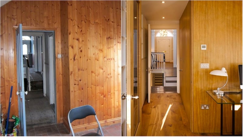
This project, carried out by Diarmaid Brophy Architects, involved the refurbishment of a protected structure – a mid-19th century terrace single-storey over-basement property with a two- storey return to the rear. This house type is a major part of the built urban fabric in Dublin, and while the property retained much original detail, it was in a particularly poor state of repair. It was fully refurbished to create a modern comfortable home, retaining its authentic character throughout, and complementing this with simple, honest spaces that work.


The design approach was key to achieving this, and as ever, it was simple. The two main rooms upstairs have been interconnected to provide a kitchen to the rear, overlooking the west facing garden, with a formal dining room to the front. It is a common mistake in such houses to overindex on the works to the ground floor at the rear of the house, as this is where most of us think we will spend the most time.
This approach would neglect the finest rooms in the house. The layout here allows the unique characteristics – details, room proportions and large period features, to be enjoyed everyday.
Downstairs, bedrooms are accommodated in the two main rooms. Ancillary spaces – such as storage, laundry and amazingly (given the tight floorplan constraints) a boot room – are discretely accommodated. This makes the most of the available floor area while keeping these private working elements hidden from view. It also allows opens up other spaces, to interconnect and seem bigger and more open. It is a clever design which makes all the difference.

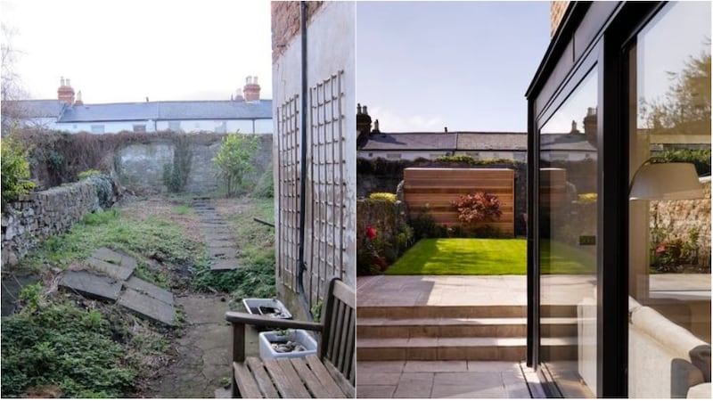
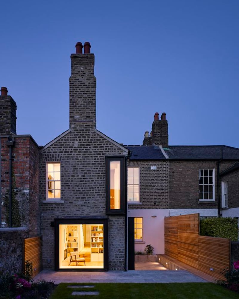
Downstairs at garden level the new living room, located in the return, is glazed on one side to open on to a new patio area.A large picture window at the end of the room doubles as a window seat and gives a framed view of the garden. The ideas are elegant and simple, executed with great skill and attention to detail.
Upgrading period homes is always tricky and yet here energy efficient measures include insulation in discrete locations to maintain the character of the existing house, draught proofing of windows and doors including several new double glazed sash windows matching the style of the existing, the installation of a decentralised ventilation system and a new heating system with the latest web enabled controls. Old and new, sitting side by side.
This is all about function – and it really has to come before everything else. It allows efficiency of space, flow, light and ultimately, enjoyment and longevity. It’s designed to last. Designing is about logic and problem solving, which is then brought to life through materials and personal style.
The function has to come first – otherwise, everything else will simply crash around it. In this project, that was a risk no one could afford to take.


