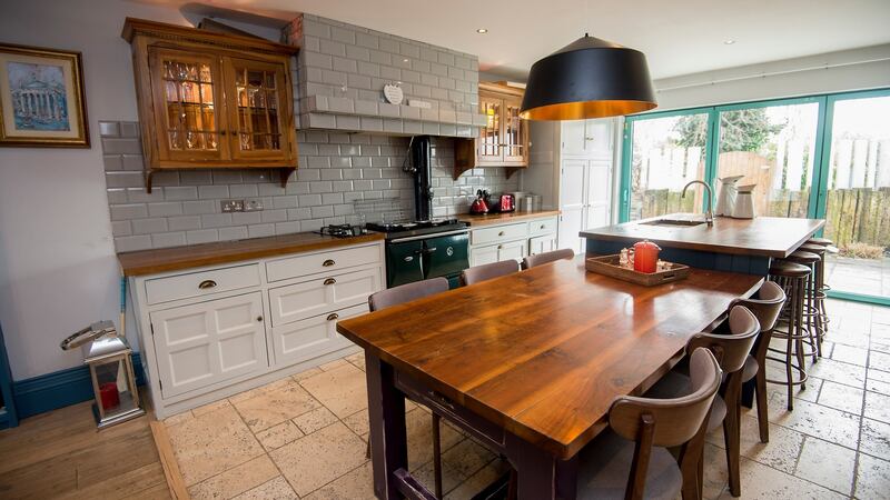
When RTÉ television presenter and entrepreneur, Kathryn Thomas, bought her first home in Dublin 8 more than 10 years ago, she envisioned it becoming the ultimate party pad.
“I was in my mid-twenties then and my brief to the architect [Wendy Lyons] was clear: I wanted a kitchen table big enough that people could dance on it, and a massive island where everyone could congregate around and sit for hours drinking and chatting.”
Lyons delivered and knocked through almost the entire downstairs into one big open-plan space, with floor-to-ceiling windows along the return wall, making for a bright, expansive entertainment hub that has been the backdrop to many late nights and raucous dinner parties over the past decade. “Because of our proximity to town, and our fairly open-door policy, the house has become something of a train station, and for many years it was party central. There is literally always someone passing by, or friends or family staying in the spare room for a few days,” says Thomas.
When her partner, restaurateur Padraig McLaughlin, moved in four years ago the house became more subdued with cosy nights in for the couple with their two dogs and the cat.
I actually want the baby to be late now, so I can sit in bed in my new room for the next week, eat cereal and ice cream
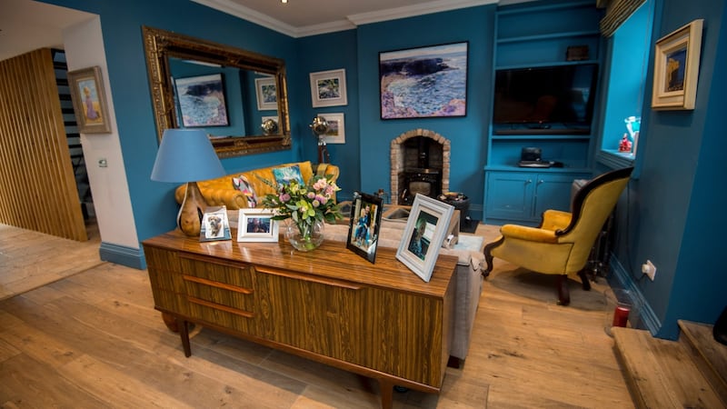
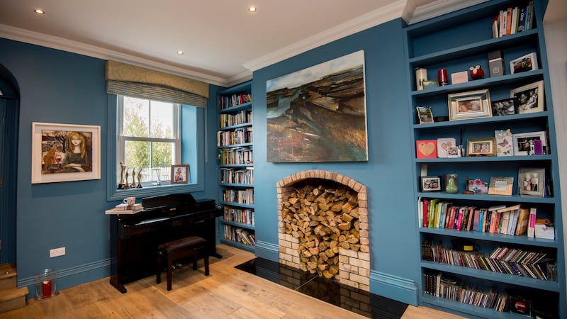
“I started getting really into interiors and changing up the design of the house in the past few years too. Initially, the decor was all cream walls, floral curtains and country-kitchen style. Then my taste matured a little and I painted everything grey and went for a very minimalist vibe but in the past few years I’ve totally gone over to the dark side. I love deep, moody colours now like navy, teal, mossy green and slate greys. I used to assume that dark colours made a space darker and smaller, but all my years staying in hotels for work has taught me that’s not the case. If you work with textures, metals, lighting and layers, those rich, dark shades look amazing and really add depth and character to a room.”
Although Thomas was happy with how her house looked, she was growing weary of how it was functioning.
“We had absolutely no storage, so much so that the third bedroom, which is also my office, had inadvertently turned into a walk-in wardrobe. We had the washing machine out in the shed, the freezer out in the garden and no tumble dryer. The radiators always seemed to be littered with drying socks and underwear whenever visitors arrived,” says Thomas.
Baby friendly
When the happy news came last year that the couple were expecting their first baby, Thomas knew it was time to get practical. “All my mum friends had warned me that when kids arrive, the washing machine is on 24/7, a tumble dryer is a must, and you need triple the storage for all their clothes and paraphernalia. We also had an open staircase with floating steel steps that my dad built for me when I moved in, and while it was a stunning focal point, it was absolutely not baby friendly.”
She enlisted the help of Karina Heaslip from Optimise design to help figure out the best way to restructure the house to make it more family fit.
“Downstairs we rejigged the utility room and the under stairs WC to create a large utility/boot room with great storage fitted out by BeSpace. We kept the utility units a soft grey and introduced a beautiful warm colour with Dulux Nomadic Glow and added texture by way of intricate tiles from The Tile Merchant,” says Heaslip.
Thomas, having researched utility rooms at length on Pinterest, insisted the washing machine and dryer were fitted at counter level and had a massive washing basket for whites and another for colours installed under both machines. Beside it, she now has a linen and ironing closet and also had the BeSpace crew design a pull-out clothes horse that sits adjacent to the hot-water cylinder for speedier drying.
“We’ve really gone from one extreme to the next with this space and I swear it’s now my favourite room in the entire house,” says Thomas.
Sophisticated finish
Thomas didn’t want to close in the open stairwell entirely, so Heaslip designed a vertical slatted wooden wall which acts as balustrades but also creates a space below – now earmarked for buggy storage. “We painted the stairs, kitchen island and main wall in this dark navy colour [Dulux Steel Symphony 1] and added gold double-ended wall lights from Hickens, which gives the space a real sophisticated finish that reminds me of a museum,” says Thomas.
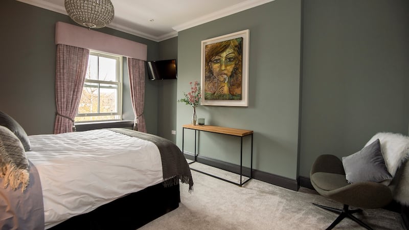
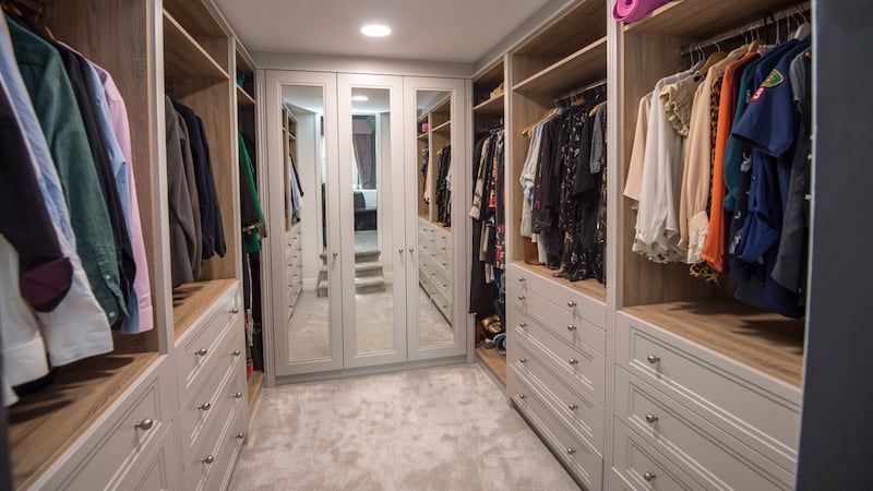
Heaslip also had to find a new home upstairs for Thomas’s vast clothing collection – and the baby. “We decided to move Katherine and Padraig into the smaller bedroom and then split the original master bedroom into a nursery on one side and a generous walk-in wardrobe accessed through a new opening from the other bedroom,” says Heaslip.
“Although we are now in a smaller bedroom, it actually feels bigger as we just have the bed, two side tables and a nursing chair in our room now and everything else is neatly packed away in the wardrobe. I used to have a big dressing table, which I never used. Now I’ve a full-length mirror and a few shelves in the closet for all my grooming bits and natural daylight LEDs in there, so I can do my make-up in there perfectly too.”
The building work was only completed last week, just days before Thomas’s due date and miraculously was all done and dusted in under five weeks.
"I think I hit the jackpot when I found husband and wife team, Wayne and Anne Marie from Beegan Build. Wayne got on with all the actual building works, while Anne Marie, a mum of three herself, knew the deadline I was up against, so made sure the schedule was executed with military precision."
While the building works were going on, Thomas sourced the finishing touches in her favourite interiors haunts: Meadows & Byrne for mirrors, throws and accessories; Lucan fabrics for curtains, cushions and bedspreads; Mac Salvage for knick-knacks and Hicken Lighting.
Nesting instinct
Thomas blames her nesting instinct going into overdrive for all the household changes: "I hung the last mirror last night and I'm done. I'm delighted with the outcome and I feel like we've an entirely new home and a fresh start for our next chapter as a family, but I don't want to see another paint swatch for at least a decade. I actually want the baby to be late now, so I can sit in bed in my new room for the next week, eat cereal and ice cream and binge watch Netflix as it's probably the only chance I'll get for the next 18 years to have some time out for myself."


