
1. GO FOR BOLD COMBINATIONS
Helen Turkington, interior designer who has her own eponymous paint range, made by Colortrend, suggests amping up the glamour stakes with a bold black and gold combination.
“The open plan rooms of the house, the kitchen and adjoining living areas, are now all about saturated colour. You need to own a big kitchen to be able to take the deep shade you select. Those less brave may just opt to paint the island.”
But dark intense colour is only half the story, she says. "It's not enough to paint the cabinet doors in colour but you also need to also factor colour into the internal pats of the cabinetry. The combination of black with gold internals or vice versa is very dramatic and works really well too in a bar or lounge area, as pictured. In our paint range, Cotton is a flaxen yellow that works really well with Coal, an intensely pigmented velvet black.". helenturkington.com, colortrend.ie.
2. GO DARK AND MOODY
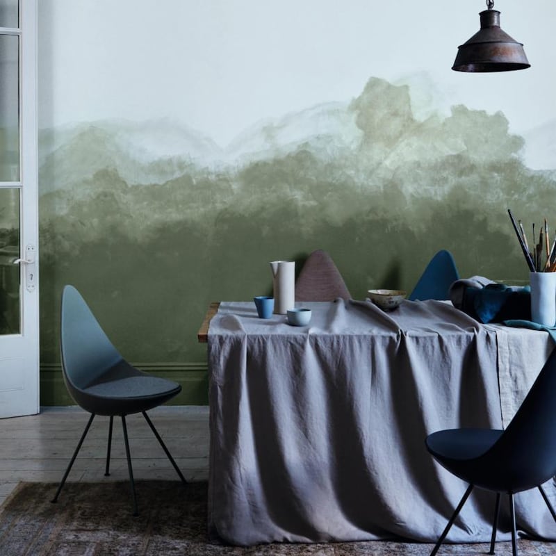
Neville Knott, interior designer and head of trend colours at Crown Paints, wants to wash walls in dark and moody combinations.
“For decades now paint has been used in a very polished fashion to create Insta-friendly interiors but there’s been very little artistic flair to how it has been applied. This is now changing with the return of Victorian paint effects like the simple sponging of walls, dipping a sponge into a watered-down version of the colour gives great drama especially when used at wainscot level.”
Knott, along with the rest of the creative team at Crown Paints, looked at colours in plastics and especially sea plastics to see how that colour faded when washed, to help us create shades that were more muted, he explains A mud green that Crown Paints calls Steam Engine green is what is pictured to create a fluid, artistic effect. The look pictured is a lot more sophisticated than its 1990s earlier versions, Knott says. "It uses a dark, landscape green, inspired by the works of artists such as Paul Henry and Jack B Yeats." You'll find tutorials for paint effects and ways to use sponges online; crownpaints.ie.
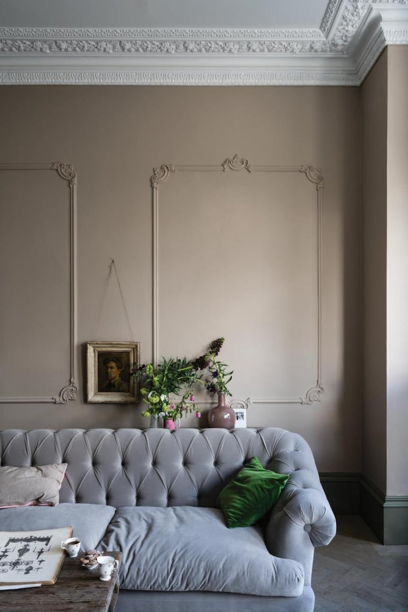
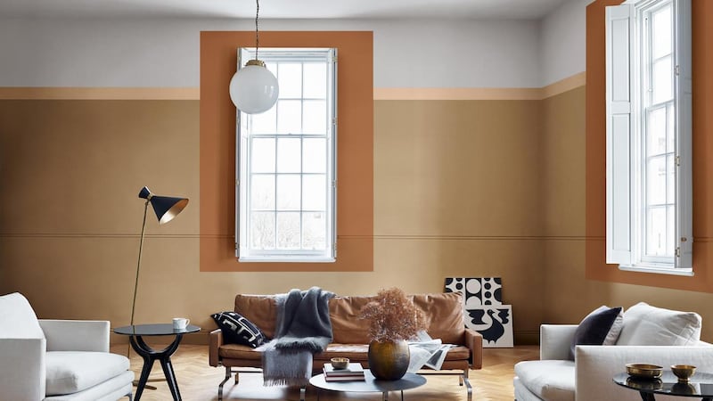
3. GO OFFBEAT
Roisin Lafferty, interior designer, creative director at Kingston Lafferty and Fleetwood Paint ambassador, wants to move away from colour saturation to more offbeat shades.
“For the last few seasons colour has been used in an intense and saturated fashion which works really well on paper but can be more difficult to embrace in real homes. The idea here is to try and create a contemporary setting within a period frame. The colours are all half a tone off pure shades so they look a little offbeat and a little worn – like there were in situ for decades. This offbeat approach dulls the Monet Dark, a grey-green by half a tone to help create a timeless canvas that forms the perfect backdrop in which to mix modern furniture with antique heirlooms.”
Used inside there's a lightness to it that offers a contemporary alternative to white and it works especially well when mixed with Capital White on architraves and ceilings if you don't want a completely new look but want to refresh a room, she explains, adding that the Vogue range is easy to apply, offers great coverage and has a matte finish that creates a more intimate atmosphere; fleetwood.ie.
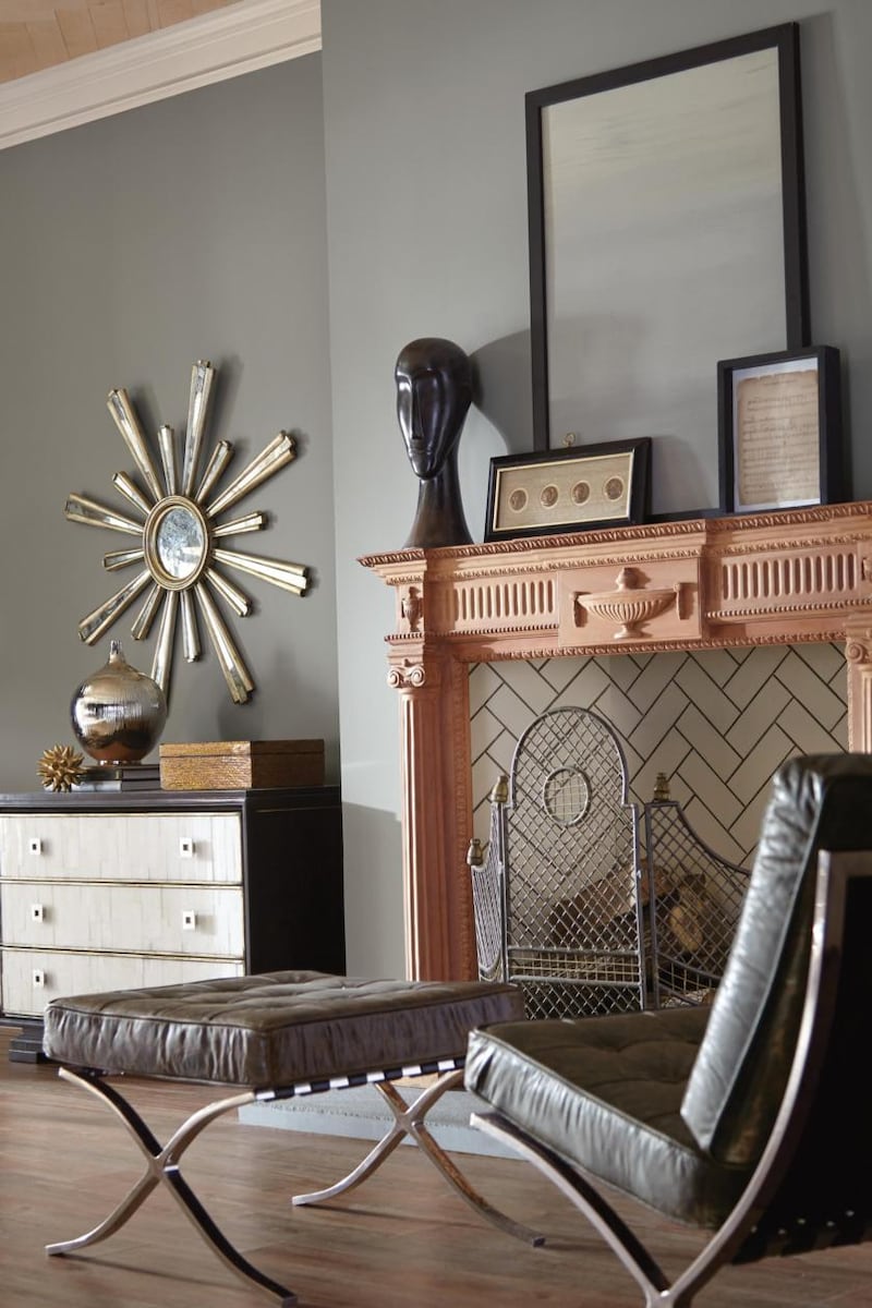
4. TRY THE NEW NEUTRAL
For Charlotte Crosby, head of creative at Farrow & Ball, the firm that brought us Elephant's Breath and each of its new colours has a raison d'être. Jitney, pictured on the walls, is a nod to consumers' move away from grey in favour of a warmer, softer brown-based neutral. Launched last week it is one of nine new colours added to the range to update it. Sulking Room Pink, another shade making its debut, is an update of the newly archived Smoked Trout, tweaked ever so slightly to bring it up to date. Every reimaging is intended to fill gaps in the core palette. Paean Black, for example, is a black for red tones, but while grey has gone from a bit of a cult shade to a really popular one, it certainly still has its place in our palette. Many of F&B's colours are historically rooted. Yeabridge Green is named after an 18th-century Georgian Hamstone farmhouse in Yeabridge, Somerset, where the colour was discovered behind the original gun cupboard. The firm also looks to people it knows and loves such as its International Colour Consultant Joa Studholme, who inspired Joa's White. Charlotte's Locks is actually named after Crosby's hair – although she says it's not quite as bright as the hot orange colour; farrow-ball.com.
5. GO GREEN
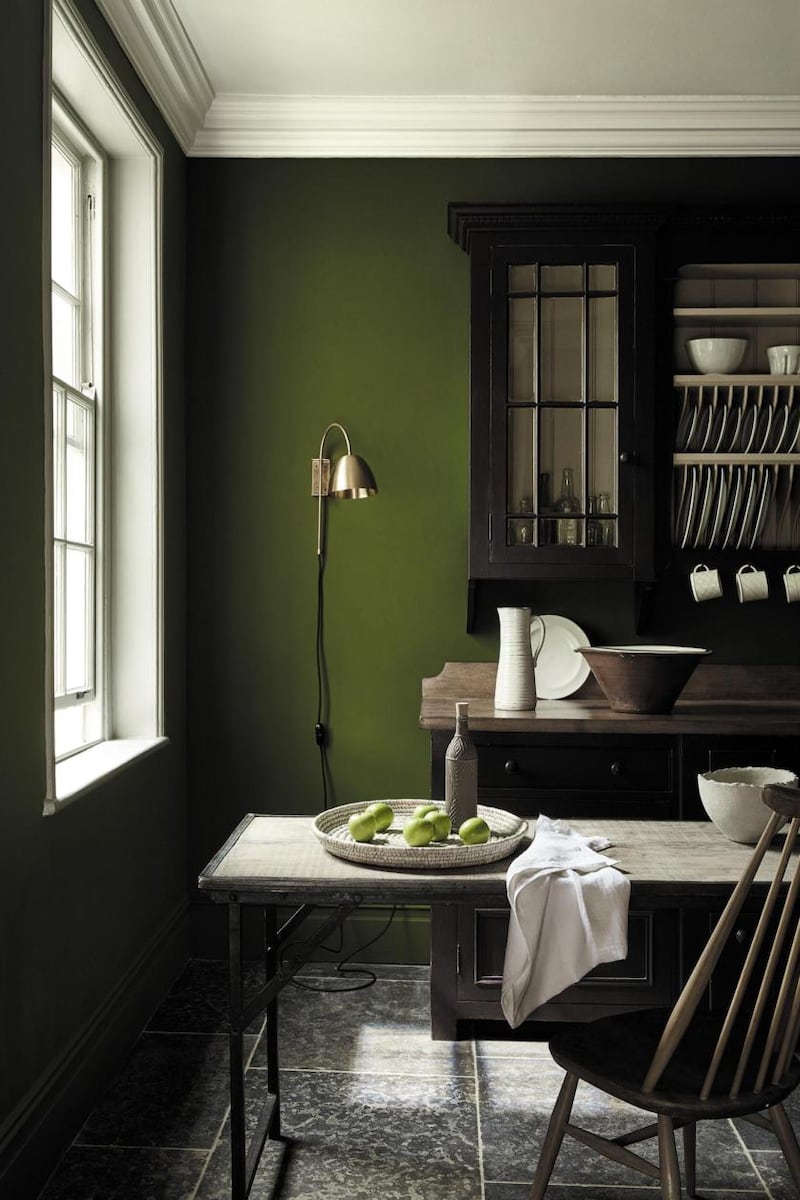
Jenny Luck, interior designer and colour consultant at Little Greene, says its time to go green and try one of its 31 new shades.
After a sea of blue being used in kitchens and living rooms fashion’s colour wheel has turned to green with the Little Greene paint company introducing 31 new shades inspired by heritage properties across the UK and Ireland including Mount Stewart in Co Down and George Bernard Shaw’s revolving hut in St Albans.
"Jewel Beetle, on the walls pictured, is a much more grassy shade of green that when used on kitchen walls feels like you're flying over Ireland's patchwork quilt of green fields. It is a much more natural looking shade of green and better used in daylight rooms. When you've applied a few coats if appears quite velvety in finish. In a more traditional kitchen it looks really good on a kitchen dresser"; littlegreene.ie.
6. SWEETEN YOUR HOME WITH SPICED HONEY
Aoife Rhatigan of Restless says its time to mine the golden age of colour with a sweet shade of spiced honey.
This autumn it’s all about the golden age of colour, says Aoife Rahtigan, who is creative director at Restless and has run workshops in conjunction with paint company Dulux. “When done right these look really rich and sumptuous, and using lighting you can change the mood of a room so that it works in sunlight and also after dark, like a dress that can take you from desk to dinner with a simple change of accessories.
One easy option is Spiced Honey, Dulux's colour of 2019, the interior version of the classic camel coat, is how Rhatigan describes it. "Its rich shade of amber looks effortless and works really well with blonde woods. In period homes you can colour outside the lines to underline the property's period window fames as pictured; dulux.ie; restless.design.
7. WARM UP WITH RICH ROAST CHESTNUT
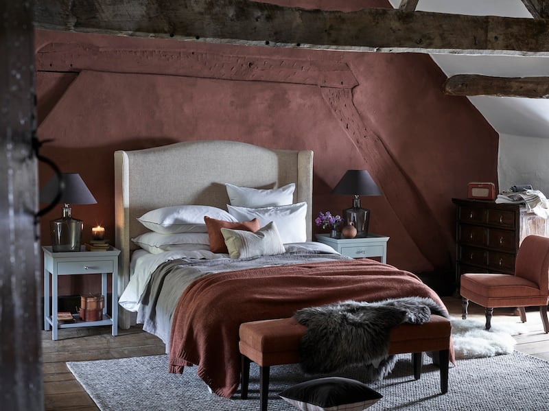
Neptune has gone nuts for deep rich shades relaunching two colours, walnut and chestnut (pictured on the wall behind the bed) for its winter palette, bringing the collection to 30 shades.
The chestnut has been updated to make it a deeper shade that is more characterful, explains Veerle Vanoppen, Neptune’s head of international retail.
“The finish is really matt and chalky so there isn’t too much light reflection. Because the paint is also highly pigmented you get interesting depths of tone at different times of the day as the light changes. The wall shown here features lime plaster and its porocity will also change the look.”
This colour will look less patchy on modern plastered walls, she says, but you can achieve a similar effect by adding a tiny bit of water to the paint and either using rags or sponges to create a texture similar to that shown.
In an emulsion finish it costs €49 for 2.5 litres and €86 for five litres. Sample pots cost €6 each; neptune.com


