
Is there a better place to get up-to-the-minute interiors inspo than on Instagram? A place to breathe in the creative talents of designers and rest your eyes on some seriously beautiful rooms, the photo-sharing site is the best place to see what trends are coming up and sticking around.
British website HomeHow.co.uk has examined hundreds of hashtags on Instagram to find out what are the most popular paint colours of the year. Already, the most Instagrammed paint shade of 2020 is Zoffany's Paris Grey, which has been hashtagged almost 24,000 times. A gentle, slightly warm grey, it makes for a versatile neutral.
UK Interior designers Woodhouse & Law (@woodhouse_and_law) smartened up a shower room in Bath with a lick of Zoffany's grey paint, creating a space that's at once energising and calming.
Paris Grey also appears to be the shade du choix for fans of upcycling.
Rustic
Paint specialist Annie Sloan has a Paris Grey chalk paint that has been applied to several simple dressers and sideboards to create a piece of furniture that's at once contemporary and rustic. Chalk On Wood (@chalkonwood), who creates bespoke hand-painted furniture in the UK, has done wonders with a simple pine dresser and some Paris Grey chalk paint. Elsewhere, the Curious Glass House interiors blogger (@thecuriousglasshouse) turned a bureau bookcase into an eye-catching item with a lick of Paris Grey.
Following right behind Paris Grey on the popularity chart is Farrow & Ball's Green Smoke shade, a bathroom- and kitchen-friendly grey/green hue, which has been hashtagged 21,355 times on Instagram, according to research. Hall Farm Cottage (@hall_farm_cottage) in Norfolk has teamed this shade with navy accents and mustard furnishings to impressive effect.
Speaking on the Top 15 most Instagrammed colours of the year, interior designer and colour consultant Regina Rogers-Fallon (reginarogersfallon.com) notes that this is a good summation of the colours that designers are favouring right now.
“These are more or less the colours I’ll be using myself at the moment,” she notes. “The only one that I personally might not use would be Polished Pebble, but only because it’s the one tone that, to me, looks a little cold or washed-out looking.
“Aside from these, dusky pinks are also huge at the moment – not just for kids’ rooms, but in master rooms, paired with a little beige or with navy or grey.”
Referring to Farrow & Ball’s Sulking Room Pink, which has been hashtagged more than 8,500 times, Rogers-Fallon suggests: “If I were using that tone, I’d pair it with a walnut floor or a mink carpet – you could also have fresh looking, off-white bedclothes and navy furnishings and accessories.”
Greys – among them Farrow & Ball favourites Purbeck Stone, Jitney and Skimming Stone – feature heavily in the top 15. Roger-Fallon is a fan of the warmer grey hues.
“I like the beige-greys – they have a significantly longer lifetime than the coal-grey or blue-greys, which can sometimes read as a little cold,” she notes. “Beige-greys, like Paris Grey or Skimming Stone, are really timeless. The Jitney shade looks to be in between a grey and mink tone – if you were to paint a kitchen in that colour, I’d be a big fan of that.”
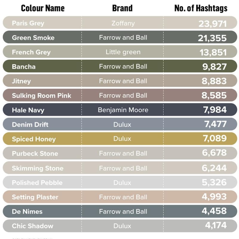
There are a few wild cards in the line-up: Dulux’s Spiced Honey (hashtagged 7,089 times, and the manufacturer’s colour of the year for 2019), a warm gold-brown, reportedly works well with browns and blacks.
Warm and bright
“It’s a fantastic colour,” enthuses Rogers-Fallon. “Years ago we had the mustard and lime colours, and if you look at this one, there’s a tiny element of citrus green and a little bit of mustard. That to me is a feature colour that needs to have something fresh, like Skimming Stone, paired with it. I imagine it working really well in a conservatory, making it really warm and bright.”
Home décor enthusiasts Mrs & Mrs Edwards (@ourhome_no12_) have used the shade in a bedroom, teaming it with charcoal accessories, while Manchester-based Instagrammer Lorna Pemberton (@wicker_in_the_window) has used the shade to make a bedroom even cosier.
Farrow & Ball’s Setting Plaster (4,993 hashtags), a muted peachy cream, is another slightly unusual neutral, while their Bancha Green (with 9,827 hashtags) is a statement-making safari green that’s perfect for a minimalist, window-heavy space.
“I use a huge amount of greens [like Bancha] in my work,” observes Rogers-Fallon. “If you’re trying to contemporise a period house, this shade of green is particularly useful. If you team it with a very dark, almost-black grape tone, it’s a combination that can be very striking.”
Navy and blue are also holding their own in the popularity stakes, with Benjamin Moore's Hale Navy (7,984 hashtags), Dulux's softer Denim Drift (7,477 hashtags) and Farrow & Ball's De Nimes (4,458 hashtags) proving to be the more share-worthy shades. Cheshire-based Instagrammer @mum.made.interiors is clearly a fan of Denim Drift, teaming it with white and pink to brighten up a bedroom.
New Jersey-based interior designer Nicole Reid (@homeonpoplarcreek) has used Hale Navy on the walls of a young child's bedroom, to create a timeless look that will still be in style in years to come.
“To me, a grey-navy tone is one of my favourite colours – I really am obsessed,” admits Rogers-Fallon. “With Hale Navy, you’d almost have to ask yourself, is that a grey or a navy? It has that really warm tone, and can be quite a moody colour. In fact, I love navy so much that I’ve used it in my own kitchen.”


