It used to be the norm to bring home local crafts, or a few culinary treats from a holiday in the Algarve, but it seems nowadays the Irish want more than just a sprinkling of Mediterranean style.
For those who holiday there regularly, some are beginning to draft in Portuguese architects for projects at home, to ensure the modern Algarve aesthetic transcends completely.
One such architect is Francisco Guanilho Duarte, creative director of SolAmbiente, an interior showroom and design agency based in Lagoa, Faro. "We've been commissioned by lots of Irish of late. After we finish their holiday villas or apartments out here, it's very common for them to ask us to oversee renovations of their properties in Ireland, " says Duarte.
One of the major attractions of working with a Portuguese architect is that they typically oversee all of the interior elements of a renovation too, from tile choice to the length of couch you select, and they can source luxury materials locally for much less than you might pay otherwise.
Our client wanted to inject a little Portuguese creativity into the house, yet we had to respect its Victorian heritage and framework. It was a brilliant creative challenge
“Typically we can get marble or stone, for up to 50 per cent cheaper than what you normally pay for it in Ireland. We have a long history and great relations with the quarries here, so clients benefit from this. There’s also a large pool of highly skilled stonemasons, ironmongers and craftspeople here. We work closely with them to produce elements of a scheme locally and then we ship all the parts of the jigsaw together to Ireland. Once they land, I fly over with a team of specialised tradesmen to supervise the installation to make sure everything is perfect.” says Duarte.
A recent collaboration Duarte is particularly proud of is the renovation of a period home in Dublin. The client had just downsized from a large family home and had a lot of furniture and art to decant into a much smaller footprint, so really wanted to make the most her three-bed Victorian terraced house.
“She had commissioned Dublin architect Peter Clarke for the job. But as a regular in the Algarve and frequent customer of the store, she asked me would I collaborate with Peter and her on the design of the kitchens and bathrooms. She wanted to inject a little Portuguese creativity into the house, as we’re known to push the boat out design wise, yet we had to respect the Victorian heritage and framework of the house, so it was a brilliant creative challenge to be part of,” says Duarte.
Communications between the client and two architects began with plenty of Pinterest boards and Skype calls back in January 2017. The brief was to create an open plan kitchen and dining area that would function as a busy family hub, but also be elegant enough to host large dinner parties and entertain in all year round.





Clarke reconfigured the lower ground floorplate to accommodate the brief by poaching space from the front room and building a modest extension to the rear to house a large dining area. He also dug down the garden level so it was flush with the extension, and the interior and exterior spaces would run seamlessly into each other.
Meanwhile using Clarke’s floor plans, Duarte worked on kitchen design concepts and finding the perfect materials back in the Algarve. “The client wanted to move away from neutral shades and invisible kitchens. She wanted to make a statement with the units and use rich colours and lots of textures.”
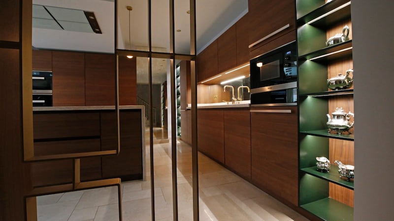
In the end, the trio chose a matt walnut Leicht kitchen as the rolling wood grain gives so much depth and warmth. Chic brass trim, brass taps and antique mirrors were then added to add more than a touch of Art Deco glam to the room.
Mirrors were further used to clever effect along the archway which delineates the kitchen and dining zones and gives the sense of a double volume in the extension. A contemporary take on a butler’s pantry was built at the end of the dining space in the same style as the kitchen units, complete with a wine fridge, cocktail bar, work space and lots of cabinets for storing all the glassware and paraphernalia needed for entertaining.
We call it royal marble as it was used in so many of the parliamentary and imperial buildings
The monolithic island takes centre stage in the kitchen, wrapped in Portuguese Lioz marble, and painstakingly edged to create the effect of pages of an open book. “We call it royal marble as it was used in so many of the parliamentary and imperial buildings of the country back in the 18th century and it was always finished to the highest standard,” explains Duarte.
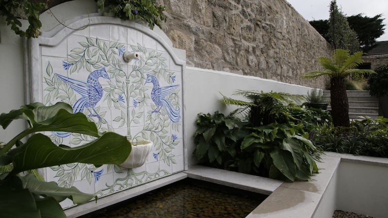
Continuing the Portuguese theme out on the patio, an elegant wall fountain is embellished with a backdrop of hand-painted tiles from Porches Pottery in the Algarve.
While the centrepiece of the garden, designed by Sarah Jordan, is an ancient huge olive tree, which was rescued from a Portuguese olive farm, where it no longer bore adequate fruit. “We didn’t know if it would survive the transplant process, let alone make it through the crazy winter we just had, but it’s settled in and is thriving now. It’s the best living piece of salvage I’ve ever encountered,” says Jordan.
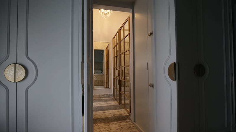
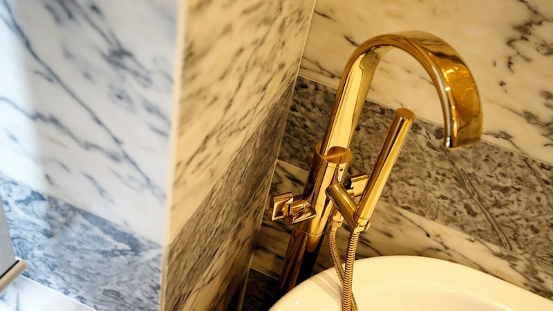
The smaller of the three upstairs bedrooms was repurposed as a main en suite bathroom and the elegant brushed brass hardware, gilded tiles and swathes of marble, make the room feel both decadent and enormous.
“We used lots of optical design ruses here, from running two different types of marble (Pele de Tigre and Lagoa Azul) in horizontal bands all around the walls which makes the room feel ample, to using metallic wall tiles, with brushed, mirror and matt surfaces, which reflect light without being too shiny,” says Duarte. The Crittall-inspired glass and brass-trim shower doors, which ingeniously double up as a toilet divider, complete the five-star hotel finish of this glamorous en suite.
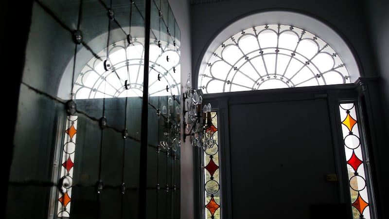
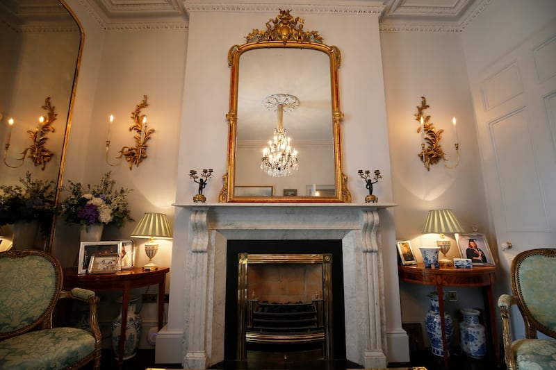
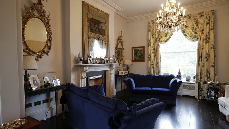
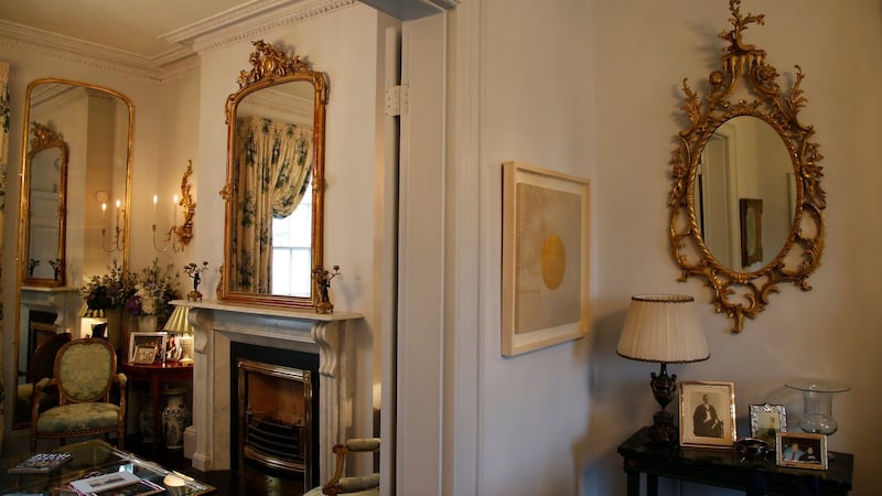
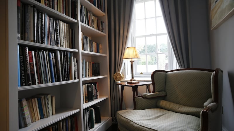
The two interjoining reception rooms on the hall floor are the most period-looking part of the house but incorporate contemporary trends with a dark wood lacquered floor and a blue-grey paint scheme.
The brass theme is elegantly echoed in the reception rooms
At first glance, it appears as if the same paint colour has been used on the walls, architraves, cornices, ceilings and woodwork, but in fact, it’s five different stepped shades of the same colour from the Paint & Paper Library London, which are specifically mixed to bring subtle depth to neutral schemes. The brass theme is elegantly echoed in the reception rooms with antique mirrors and modern bar trolleys mingling among royal blue velvet couches and a finely curated art collection.
The result here is a lesson in pushing the boundaries not just in terms of interior finishes but in thinking outside the box when choosing a team to work with on a project.
“Peter and I have very different aesthetics and the client had very strong design visions too. It could have been a case of too many cooks but it ended up being a tremendous meeting of minds. We all pushed each other out of our comfort zones, or back into our boxes when we got carried away and the finished product is a testament to how creative visions, can come together cohesively,” says Duarte.


