
Paint sales soared last March when Covid-19 struck, with increases ranging from between 40 and 200 per cent, depending on which supplier you talk to. There was a novelty to being at home and the weather was getting warmer.
“While spring is the traditional time to celebrate new trends in paint colour it’s a little different now because everyone is still indoors,” says Declan McCarthy, owner of Stillorgan Decor which has had to close its curtain and lighting sections but is still selling paint via click and collect or home delivery.
With everyone cooped up inside still he advises against doing a big job in important rooms such as the kitchen because it could start a riot if all those living under one roof suddenly find access to an essential room curtailed. Instead he suggests starting with a spare bedroom or a play room where stir-crazy kids might even get stuck in.
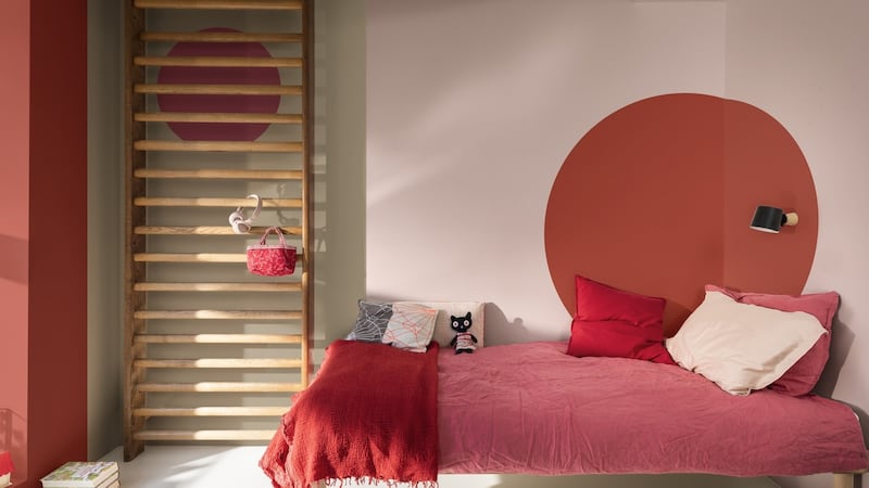
You can bring in personality by playing with shape and colour, says Dulux colour specialist Jane Witter. Dulux’s Pink Sandstone is gorgeous on walls and the corner circle can be sketched out first in chalk before outlining it in pencil and then filling in the round using Soft Coral, a warm red with lots of yellow to offer depth, Witter explains.
If your kitchen really needs brightening then Aughrim-based interior designer Collette Ward suggests starting with something small, like kitchen chairs, breakfast bar stools or the base of the island to make it feel fresh.
Offbeat neutrals
For a more substantial upgrade Ward advises the offbeat tones of 2021’s new neutrals. She just completed a project in a smartly reimagined bungalow, with a long vaulted space by architect Kim Dryer where the kitchen stood at one end and living area at the other.
“It overlooks the Sugarloaf and because of the view the room needed colour and the layering of gentle tones to make it feel contemporary,” she says. The Noel Dempsey-designed kitchen features a glacier blue on the island and Irish paint firm Colortrend’s Miracle Bay adds a deeper shade of cool blue on the high level-units.
Ward say Oyster Bed, another Colortrend shade, is a very good background colour. “It’s an off-grey that works with Irish light. It has enough life in it not to look cold while fresh enough to work with a range of colour palettes. I do walls and ceilings in it as it has the impression of making any room seem bigger.”
Andes, a soft, offbeat pink she describes as being “the colour of wet plaster”, was used around the windows of the Co Wicklow house, with Thistle Grey going on the bespoke cabinetry.
Stillorgan Decor sells a lot of Batch Loaf, Colortrend’s soft taupe. “It can be used anywhere and is especially good on architraving and woodwork. Shell Cove, a classic in the firm’s Historic Collection, is a soft white and looks good on ceilings, windows and doors,” McCarthy says.
All this plays into a notable shift towards more individual interiors rather than following mainstream trends, says interior designer Ger Cooney, colour consultant at Colortrend. “Neutrals offer such warmth and reassurance.”
Small wins
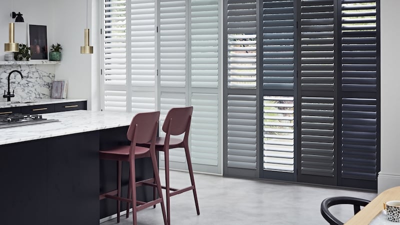
“Painting woodwork isn’t the first thing we think of when refreshing a room, but it can have a great impact and give the space a brand-new look,” says Judy Smith, Crown colour consultant. “Painting doors and skirting boards in the same colour as the walls will create a more continuous feel and make the space look larger. It will also give the room a sophisticated and refined touch that won’t date easily.” Painting window surrounds and radiators is another way to go. So too is degrade painting of plantation shutters, such as these by California Shutters.
Lustrous finish
High-sheen finishes such as gloss are making a comeback. Lustrous whites can be used to highlight a detail, such as a hall arch, in a subtle way, while darker shades can bring depth and drama to a living-room nook, kitchen cabinetry or the main bedroom. Consider Blueprint No 50, an intense aubergine shade, or Westmoreland No 160, a rich khaki green, from Mylands, a paint company that supplies the film and television industry – you’ll have seen it in the Harry Potter and James Bond franchises, Downton Abbey and Game of Thrones.
A lacquer finish – a decorative trope that featured in our own Eileen Grey’s early work – can be achieved by applying multiple layers of gloss. American designer Philip Thomas used Benjamin Moore’s punchy Ladybug Red in the walls, woodwork and window surrounds and cills of an upscale apartment on New York’s Upper East Side, painting all of them in this vibrant shade.
While it delivers an incredible intensity of colour and sheen you will need to apply multiple layers, anything from seven to 12, to create such a high-impact finish. “The thing about gloss paint is that you have to consider the condition of your walls,” Thomas told House Beautiful magazine .
A gloss finish is also highly durable and can withstand the knocks and wear of high-traffic areas such as kitchens or hallways, where its wipeability can easily banish stubborn stains.
Tool up
Choosing the right tools to apply the paint is critical when working with strongly pigmented colours, McCarthy says. For a fashion finish he suggests trying Farrow & Ball’s Duck Green, a smart deep shade named after the natural hue of a mallard’s plumage.
“Strong colours like that suit rooms we use at the end of the day when we want to relax and be comforted,” says the Farrow & Ball colour curator”, Joa Studholme. “That and earthy, organic Sap Green connect us with nature and feels perfect for the home in 2021.”
Reds and yellows, in particular, will require more coats than any basic neutral, says McCarthy. He advises using a good synthetic two-inch brush such as Fleetwood’s Advanced range to outline the wall and then fill in the rest using a nine-inch microfibre roller.
“Keep a wet edge when painting,” he says. By this he means give the whole wall a coat of paint before stopping. That way you get a better finish. His last word on the subject is to take your time choosing colours. By all means look at colour palettes online on the paint company websites, but avoid making the final selection before getting physical colour cards to see what the colours look like after dark, in artificial light and observe how the shade changes.
Ward is offering Zoom consultations to help clients move outside their colour comfort zones. A video walk-through starts at the front door and moves through the house to get a sense of the flow, while pictures furnished by the client in advance of rooms, favourite corners and items combine to create a sense of what will work best for the client.
collettewardinteriors.ie; stillorgandecor.ie; colourtrend.ie; dulux.ie; crownpaints.ie; farrow-ball.com; mylands.com; francescaspaint.com.


