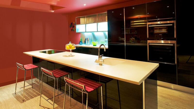
After years of looking at decorative ideas ranging from graphic paint jobs to textured applications and even living walls there is a new focus within the home, it’s about looking up – to the ceiling, which is, in essence, the new feature wall.
The idea itself though is far from new. Decorators have adorned ceilings for centuries, employing the greatest talents of their age to draw attention to that area above our heads be it in plasterwork or frescoes.
The latter is an idea that you can replicate very simply using Rockett St George’s panoramic mural wallpaper of the ceiling of the chateau de Versailles. It is a really easy and eye-catching way to amp up a room or entrance hall with good ceiling heights such as those seen in many period properties. Deliveries here are suspended but the UK retailer hopes to be able to send stock to the Republic in about two months.
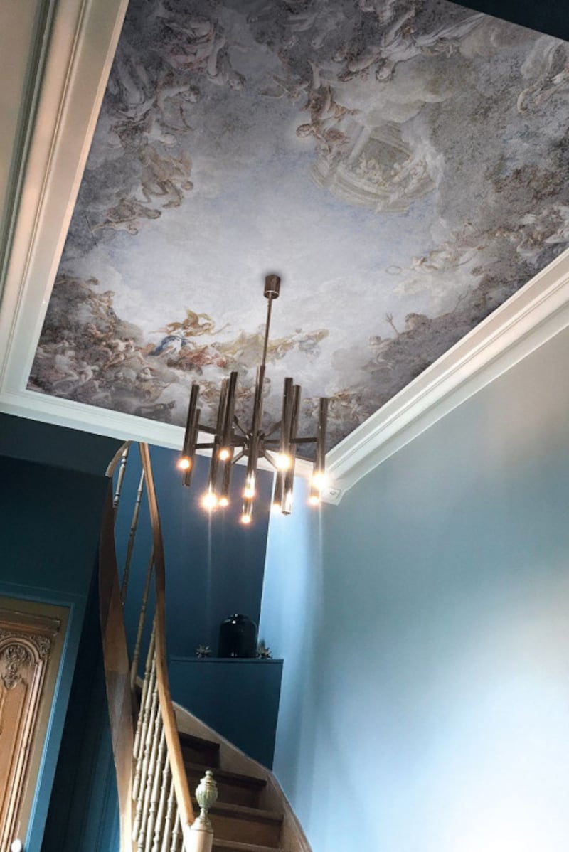
Alternatively, if you can supply a Northern Ireland address, it costs about €550 for a panel that measures 2.7m by 3.9m and its serene colours offer a painterly finish that can be done in an afternoon. If the Northern Ireland route isn’t feasible, what you can do instead is browse Shutterstock or Getty, pick this or another image that catches your eye and have Surface View print it up for you. This is more expensive as the image costs about €450 and the printing by Surface View will cost about another €1,000, ex-delivery. It’s still far cheaper than having a muralist paint it on for you.
Create drama
Other ideas can be found in the commercial and hospitality sectors where the decorative trope is used far more often.
It is a simple yet effective way to create drama, says Justin Treacy, managing partner at Perkins and Will, a firm that specialises in fit-outs in these areas, and it comes into play under considerations which include acoustic, functionality, fire, sustainability and design.
“Fifteen years ago if you’d suggested it as an idea for commercial or café use your client would wonder what you’re at and now it’s almost standard,” he says.
An open ceiling, one where you can see all the services above, has become a thing.
“You’re celebrating the beauty of the wiring, conduits, air conditioning ducts and cable trays. There is an inherent beauty in it but this really hasn’t translated into domestic design.”
When looking up in residential one of the challenges is the limited ceiling heights, he says, but in these cases, where you may just have a standard 2.4m ceiling height or even less, it almost makes more sense to try and gain a couple of valuable centimetres above your head.
A trick he suggests you try in a room with a bog-standard ceiling height is to drop the level by the depth of one sheet of plasterboard. This creates a frame effect within the frame of the room’s dimensions.
“This will make it appear as if it is floating, blurring the hard lines between the ceiling and walls so the room will feel more voluminous.” You could also add strip lighting to its edges to add further interest.

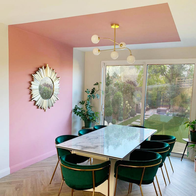
Spot lights, set between the timber joists above, rather than a ceiling pendant will also help create the illusion of space. And throwing light up to the ceiling through the use of table lamps or floor lights will also make the space more voluminous.
Canopy effect
Decorator Garry Cohn has covered ceilings in neon pink giraffe print, at Peter Mark’s Style Club, given the ceiling of the terrace cafe at The Cliff at Lyons a checkerboard effect in grey and white, and created simple trompe l’oeil effects in homes using the chimney breast to create a canopy effect.
Painting the ceiling in a gloss finish is a simple yet really effective way to reflect light, he says. It requires a very smooth surface so you need to fill in any cracks or bumps so that the effect will look like ironed silk. The technical term for a perfectly prepared surface for gloss is “flush”. It will take more than one coat of paint to get the effect and you need to let each coat dry before applying the next, he advises.
“The result is stunning. It appears to raise the roof and gives a finish akin to polished nails.”
Period properties are the exception to this flush rule, he says.
“If the space has an old ceiling with mouldings then the mouldings will catch your eye rather than the ceiling surface. They look amazing when light hits them. Again lighting plays a part in creating the overall effect. Soft lighting, rather than hard architectural styles, will create the best mirrored effect.”
There are numerous colours to play with. Conservatives can try neutrals like Flay Woven or Soft Bisque from Irish-made Curator paint, a favourite of Coen’s. Maximalists who want to go really dark can try Six Sods, an almost black that “is dramatic beyond belief”, Pulled Rhubarb, a burnt red or Soft Sun, a marigold yellow that will make the room radiate good vibes.
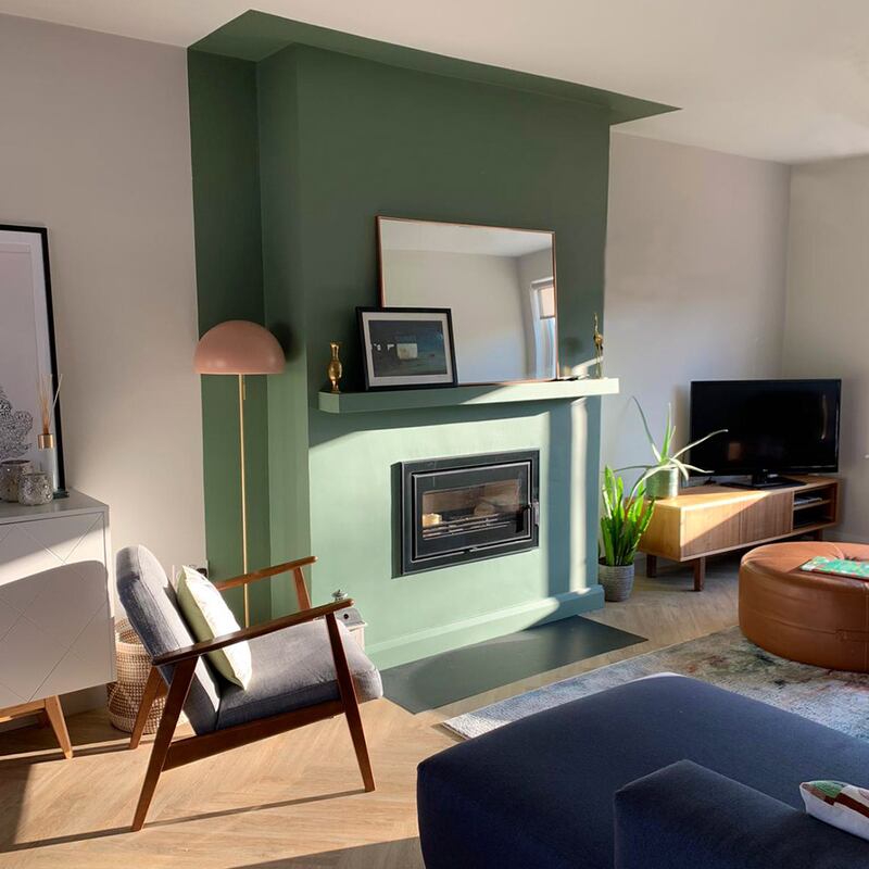
Painting the ceiling to match the four walls is another easy way to work this trend and is especially effective in period properties that have picture and dado rails, says Helen Turkington who has been doing this for years and suggests also painting the skirting the same colour as the walls.
An easy way to add texture is to expose existing rafters or roof beams. In modern builds where there is a vogue for double height spaces these can help soften hard lines. Dubai-based VSHD Design has used a-frame oak beams with blackened steel capping to great effect in one such gantried landing in a property called The Ranch, in Orlando. In Montreal, Dupont Blouin Architectes included timber rafters in an all-white contemporary kitchen – an easy way to modernise an existing style.
If you’re looking for a really dramatic effect and have the ceiling heights to carry it off then consider what Greek design house K Studio did for Restaurant Barbuni on the Costa Navarino. The pioneering thinking meant that a beachside timber shack was given a simple but beautifully effective roofscape using asymmetric-hemmed sheeting that sways in the sea breeze. By filtering sunlight, it gives natural shade and also cools by creating air movement, dispensing with the need for fans and electric lighting. Its diaphanous lines create mesmerising movement that will also give you something to talk about should you run out of conversation.
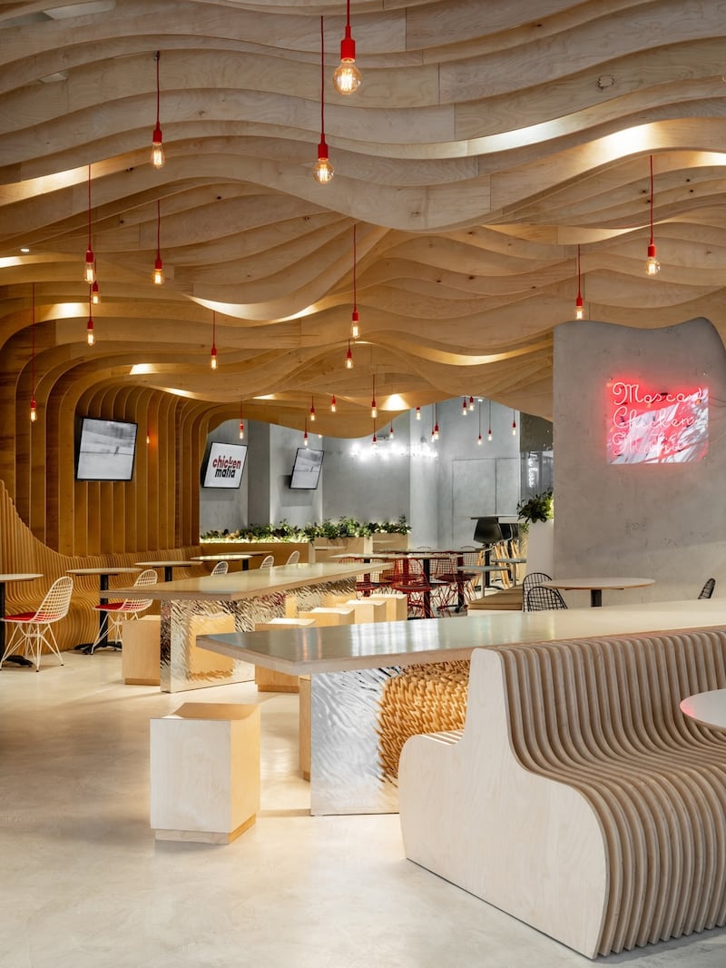
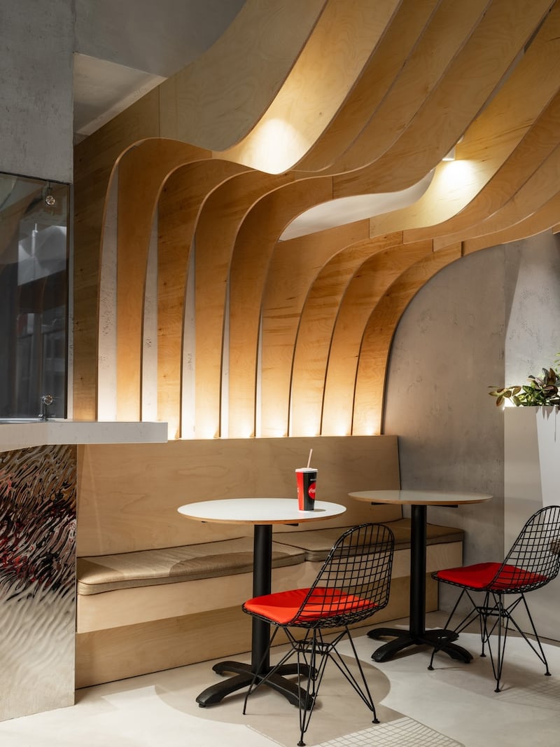
Greta Project delivered a different sort of undulating ceiling using plywood waves in its look for Chicken Mafia, a restaurant in Moscow. All help curve hard-looking square and rectangular spaces.
perkinswill.com
cohndesign.com
rockettstgeorge.co.uk
helenturkington.com
vshd.net; k-studio.gr
![‘Fifteen years ago if you’d suggested it [decorating the ceiling] as an idea for commercial or cafe use your client would wonder what you’re at and now it almost standard,’ says Justin Treacy, managing partner at Perkins and Will.](https://www.irishtimes.com/resizer/v2/QYHAI5G5YMHDKE4KA4JZ374PYA.jpg?auth=e38e0d73a20ebf0a768ea7ec166f8aa968ef734ed618677980625ba379eefb20&smart=true&width=1024&height=576)


