After two failed attempts at securing planning permission for a house on this site in Clontarf, Dublin 3, the developer-owner sold the plot. It was subsequently bought by a brave soul who believed David Leech Architects could design something substantial that would get permission. And they did, says Leech.
The problem with the previous two attempts had been that they tried to replicate the other houses on the 1940s terrace, but planning law require a certain proportion of outdoor space which was not feasible in the standard design.
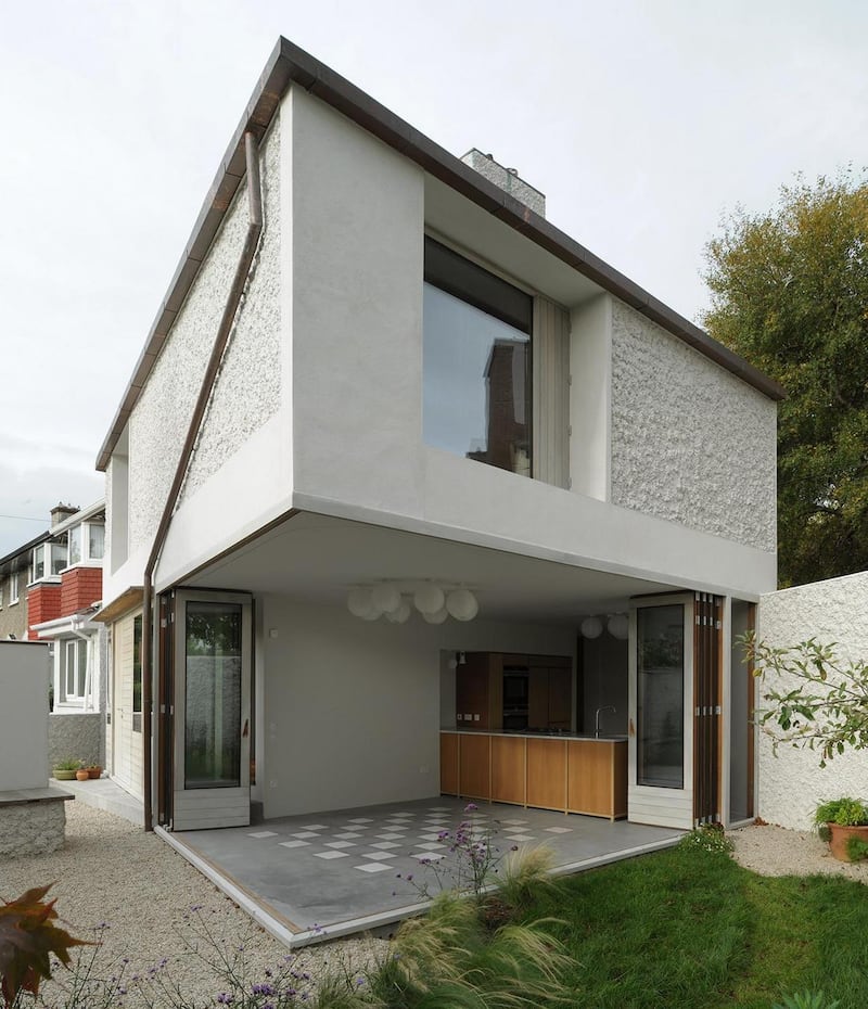
The planners had concluded that a 45sq m (484sq ft), one-bed bungalow would be the only option – and the site was sold with permission for this – but Leech felt more could be achieved: he began with the garden and grew the house in from there.
“I decided, let’s make the house about the garden,” he says. It helped that the site was enclosed by a hedge and wall. “A hidden garden-world that would feel safe and private; because of that we could have a glass building.”
The resulting two-storey 120sq m (1,291sq ft) three-bed house is based around supporting walls in the shape of a cross at its centre on the ground floor – filled with ancillaries, including plumbing, kitchen, a toilet and stairs.
This created four main spaces in the largely open-plan ground floor – a hall, kitchen, living and dining room – with timber and glazed walls dancing around the building’s perimeter. When the walls fold back, what remains is the structural cross standing as a pavilion. The entire house stands free of the site’s edge, except for one wall to the street.
“I convinced the planners that when the doors fold back the garden gets bigger,” says Leech.
And it’s true, once the doors are open the garden becomes part of the dining room floor right up to the kitchen counter, which forms part of the central cross.
Such is the emphasis on the exterior that when the doors concertina open you must walk around them – into the garden – to access the next room.
The floor at ground level undulates, creating a dynamism, while the level ceiling exerts a steadying influence on the space. Leech was inspired by the Sugden House near Watford, England, designed in 1955 for Arup engineer Derek Sugden, in which architects Alison and Peter Smithson "used steps down to differentiate the plan", says Leech. The Sugden house also has a kitchen counter dividing the living and dining spaces.
Built-in seating
On entering the Dublin house visitors step up into the hall to face library shelves whose tomes might offer a glimpse into the personality of inhabitants as you arrive (although no one lives here at the moment). Steps then descend to the dining room and kitchen, and the floor level in the living room is low too although built-in seating around the edge lifts bodies (and spirits) to enjoy the garden from an immersive perspective.
Rethinking design in such ways – away from the standard set by established terraces across Dublin – could open up hundreds of similar corner garden sites throughout the city, says Leech.

Ideally this should be done by competition open to young architectural practices, he says. This is what Brighton and Hove City Council in England did with its New Homes for Neighbourhoods competition in conjunction with RIBA (Royal Institute of British Architects), seeking design solutions for challenging sites.
While this house isn’t a copycat it does speak to the rest of the terrace that it now bookends: the roof is pitched, with similar tiles, but it is steeper and in a different shape.
The pebble-dash on neighbouring houses is also picked up but in a different texture, and it is used to define spaces such as a recess in the garden, giving it the feel of a grotto, says Leech. Alternatively, parts of the house wall onto the street have smooth plaster.
In line with the nod towards the existing terrace of houses, on this project Leech wanted to avoid the Modernist route, which is a challenge on a tight budget, he says, due to a need for perfection at certain junctures and burying undesirable elements.
Instead of hiding features such as downpipes, he makes a feature of them: they have been added to “a boring part of the facade” sloping down in a considered form, “almost like a line drawing”, says Leech. “I dream of creating a colonnade of downpipes on a future project,” he smiles.
Practices
Leech's designs draw from all of the practices he has worked for since graduating from UCD. These include Tom de Paor and Grafton Architects in Ireland before he moved to London 10 years ago, and was project architect on the £40 million Tate Britain extension with Caruso St John Architects. He then headed up the river Thames to be senior architect on the Tate Modern extension project while working with Herzog & de Meuron.
Leech designs on a scale of 1:1 or 1:2, working out details before the building begins to avoid too many surprises on site. Meticulousness was something he learnt at Caruso St John, who are closely concerned with materiality, he says. "Adam Caruso would have conversations about the size of a screw," he says.
From Herzog and de Meuron he learned bravery in design. “They have an amazing skill in overcoming problems and working out super-complex buildings.”
Leech’s attention to detail measures up in the timber on the folding doors/walls which are made from heat-treated, warp-resistant wood with good insulation properties. The house is A-rated despite having north-facing glazing.
“Almost passive house, but it doesn’t wear it like a badge,” says Leech of the design and thermal properties. To achieve this he worked with a Part L consultant (Part L being the building regulation concerned with the conservation of fuel and energy).
The timber rails and rises on the inside of the folding doors exactly match the width of the latches (130mm) which dictated the design. In a further example of meticulous detailing, the glass on the exterior is flush with the wood.

Attention to detail greets you right from the front hall where light switches line up neatly.
Roof light
The exercises in scale continue on the first floor where, at the top of the stairs, there is a semblance of a tall cupboard, the landing being a non-space-guzzling one door wide and two doors long which is made spacey by the fact it rockets up 6m to the chimney and a roof light.
One of the bedrooms has a curved plaster ceiling giving it the feel of a tent, and built-in wardrobes are made from a type of MDF with colour shot all the way through. The built-in furniture, in blue and green, cleverly incorporates wardrobe doors, drawers and the door to the room as one unit. The same colour spreads along the wall to frame the radiator and bed. Again, it’s all in the detail along with creativity.
Maybe this is a new recipe for inventively increasing Dublin’s housing stock by freeing up small, awkward sites.