One perhaps positive effect of the recession was that we didn't get the massive Antony Gormley sculpture promised for Dublin's Docklands. At the time, Gormley said the 48m-high (157ft) sculpture would "allude to the human body as a dynamic interconnected matrix evoking the collective body". Whatever it was supposed to allude to, it was going to be big.
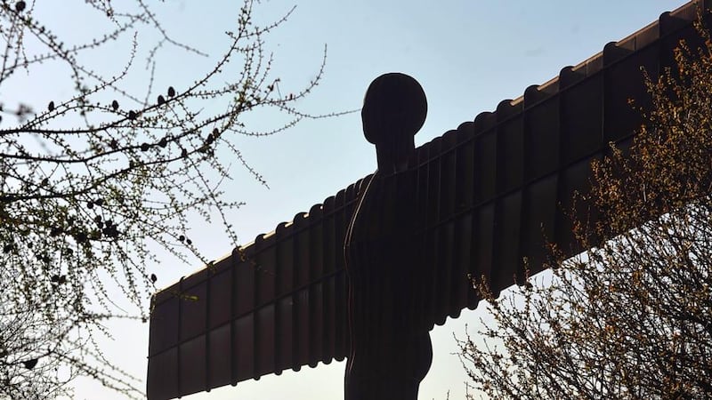
Big art has sprung up around the world and Gormley is partly to blame. His 20m high/54m wide sculpture Angel of the North, which appeared in the north of England in 1998, became an icon of the regeneration of that area, spawning a rash of imitations. Wanting a share of the feel-good press coverage and icons to market their cities, planners and local authorities rushed to commission art on a large scale.
Of course Gormley didn't invent the trend. Politics and religion had got there long before; he was simply co-opting it for contemporary public art. There are the American presidents, carved into Mount Rushmore, beginning in 1927; Rio de Janeiro's Christ the Redeemer, started in 1922 and completed in 1931; and those enormous communist icons that appeared across the USSR, now either broken up or banished to graveyard sculpture parks. More modern versions can be seen in Fabrice Fouillet's series, Colosses (online at fabricefouillet.com), which documents what the French photographer describes as "the wave of 'statuomania' [that] spread over the world in the 1990s".
One of the best things about big art is that it photographs well from a distance. That doesn't always mean it works close up. You can see this with Andy Scott's The Kelpies, recently unveiled in Falkirk, Scotland. The two horse-head sculptures are 30m high and can be illuminated after dark. The stainless-steel structures are clumsy, the shapes not quite right. But from far away, and in the right light, photographs make them look magnificent.
The galleries follow suit
The Angel was also the precursor of a trend in art in galleries where the wow factor seems to lie solely in the size: you know it's art because it's glossy and enormous.
Looking at Richard Mosse's huge photographs of the Congo, in his much lauded Venice Biennale show The Enclave, I tried to imagine how they might work if postcard size. If the main attraction is scale, does that mean bigger is better and there's little more to it than that?
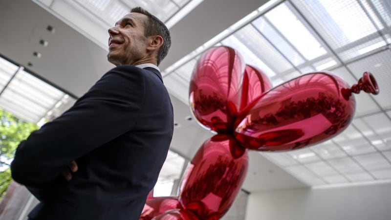
Jeff Koons employs the "size matters" tactic in sculpture, with his pieces Hanging Heart and Balloon Dog. These are huge stainless-steel shapes that vacuous super-rich art collectors lap up. Koons's Balloon Dog (Orange) sold at auction last year for $58.4 million (€42 million). You can also see big empty gesture art in the atriums of boom-time office blocks across Ireland: guaranteed inoffensive, marking status rather than artistic depth.
Another artist beloved of the ultra-wealthy, Damien Hirst, has also gone big with his 20.25m-high Verity, which has been loaned for 20 years to Ilfracombe, north Devon. The naked and semi-eviscerated pregnant figure stands on a pile of books, holding a sword aloft. After the sculpture was erected in 2012, town councillors reported increased visitor numbers and are using the boost to bid for funding to regenerate the town's high street.
The critics, of course, hate it. Writing in the Telegraph, Ruth Dudley Edwards said the statue "is another nail Hirst has hammered into the coffin of British art". I suspect that Verity would be horrible at any size.
Another economic casualty has been the so-called Angel of the South: Turner Prize winner Mark Wallinger's 50m White Horse at Ebbsfleet, in Kent. Initially funded by a group of developers looking to put their latest development on the map, the project stalled as the recession hit and projected costs jumped from £2 million to £12 million. Wallinger's horse-sized version of the sculpture now stands outside the British Council buildings in London, and it is lovely if not enormously exciting.
In fact, if a work of art is too fascinating it can't go on the side of a road. "Too good – and people might crash their cars," says Limerick City of Culture director Mike Fitzpatrick, a veteran of many commissioning panels. At Limerick, they have taken the decision not to commission huge works of art to mark the year, instead using interventions such as "borrowing" the Kerry Group's former Golden Vale milk plant on O'Callaghan Strand for use as an arts venue. "We're using the space to draw attention to a part of the city that has been forgotten," he says.
Being on public-sculpture commissioning panels is a learning experience, he says. “What I’ve learned is not to take the ‘least worst’ option. Designers work well to commission, artists not always,” he says. “Sometimes, I’ve driven past a piece of art on a motorway and thought, sorry world.”
Poisoned chalice
Beyond distracting motorists, artists also need to consider other responsibilities; accepting a public-sculpture commission is one of the more poisoned of art-world chalices. An infamous controversy arose in New York in 1981, for example, when celebrated artist Richard Serra was commissioned to create a sculpture for a public plaza in Lower Manhattan.
His Tilted Arc was a 36m-long 3.6m-high strip of corten steel. As Serra described it, "The viewer becomes aware of himself and of his movement through the plaza . . . Step by step the perception not only of the sculpture but of the entire environment changes."
Part of the truth of this was that 1,300 local office workers signed a petition to have it removed, unhappy with the way Serra had changed their entire environment, not least by impeding their routes to work. It was taken away in 1989.
Discuss Tilted Arc, or other controversial public sculptures and you begin to see how the art world sometimes does itself no favours. "But he/she is such a good artist" comes to stand in for arguments about whether this particular piece succeeds in this particular place, practically as well as aesthetically and intellectually. Just because an artist is good doesn't mean all their work is.
Sometimes the gamble pays off on all levels. Ian Ritchie's Dublin Spire (aka the Monument of Light), erected in 2002, proves that bigness itself isn't the problem. The Spire combines beauty with an appearance that can appear almost uncanny in changing lights.
It has also been cleverly incorporated into Dublin's marketing imagery and messaging. It took a while for the Spire to grow on me, and it bothered me at first that its relative emptiness and lack of symbolism might be too close a reminder of the emptiness of so many other things these days. But it's more subtly clever than that, and there's something pure about it that fascinates. I can't now imagine O'Connell Street without it.
Wind and electricity
In Ireland, our most recent controversies about large new structures in the landscape haven't been about art, but instead about wind turbines and pylons.
These are two separate issues, although they have been conflated by some campaigners. I find myself liking the wind turbines, because of what they represent – clean energy – so that their aesthetics for me become bound up with their ethics. But to see the reverse in operation, take a look at the finalists in a 2010 competition in Iceland to redesign that country’s pylons.
Although not realised yet, the proposed vast marching figures of people and reindeer can almost beguile you into thinking that overground electricity isn’t such a bad thing. Not all big art is empty, and when big art is good it can, for better or worse, change the way we feel about the world.