It’s no secret that beer has undergone a significant makeover in recent years. Far from the pints of plain on which we were raised, the discerning beer drinker now has a plethora of craft beers to choose from. Whether you’re partial to a tart grapefruit ale or a sturdy coffee stout, chances are there is something out there to sate your appetite.
Not only are craft breweries experimenting with taste and flavour, they are also reinventing how beer is marketed with many commissioning artists and illustrators to design their labels and ensure they stand out from the crowd. Where beer packaging was once utterly homogenous, it now exists to showcase design and personality. Indeed part of the thrill of visiting an off-licence these days lies in studying the eye-catching artwork on display in the fridge and waiting for one to take your fancy.
Here are some of the Irish craft breweries turning their cans into canvases.
BOUNDARY
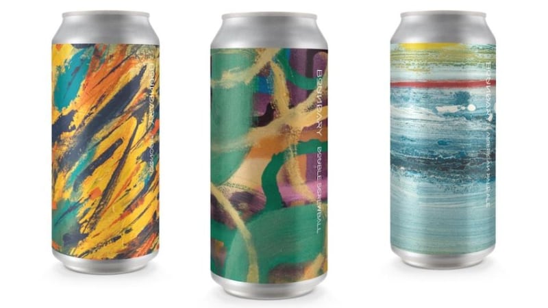
When Matthew Dick set up Boundary Brewing, a cooperative brewery in Belfast, he says that two things were clear from the off.
“The two strongest senses I had was that Boundary needed to be shared with others from the start and that my friend John’s work would look amazing on can labels,” he recalls.
He was referring to his lifelong friend John Robinson, an artist who specialises in contemporary landscape painting. At first glance, Robinson's painterly style is a far cry from the busy illustrations you typically find on beer packaging. But Dick had a hunch it could work and enlisted his friend to work with him.
It represented new terrain for Robinson. “I’ve never done anything like this before,” he says. “In fact I didn’t really know what it would look like.” Nonetheless he was “excited by the challenge of interpreting beer into paintings”.
So how does one go about interpreting beer into paintings, you ask? Before Robinson gets to work on a new label, he typically tastes the beer in question and assesses its flavour, body and appearance. That, in turn, sets the tone for the artwork.
“When I make a landscape painting I often go for a walk on the beach or in the forest,” he explains. “This sets the atmosphere for the painting. With the Boundary work the beer is the experience that acts as the anchor for the painting, which then takes on a life of its own as the painting develops.”
Inspiration can strike from elsewhere, too.
“Sometimes a concept related to the particular beer informs the painting,” he says. “With the Push & Pull series, the concept of different hops being profiled each time made me think of ‘push and pull’, the theory in abstract art where overlapping layers of paint create the impression of receding space. This formed the starting point for the painting.”
For co-founder Matthew Dick, the partnership has been nothing short of a match made in heaven.
"For us, it's become a great representation of who we are at our core," he says of Robinson's artwork. "'Be regularly and orderly in your life, so you can be violent and original in your work'. That quote from Gustave Flaubert is where we got our name from, and I think it's reflected in John's work and our labels."
Robinson concurs.
“I think the art is successful because it’s simple and authentic,” he says. “Even though each piece is different, they are clearly all connected. We have won the space of art on the can. It’s our thing. That gives us freedom to experiment and people still recognise it as us.”
YELLOWBELLY BEER
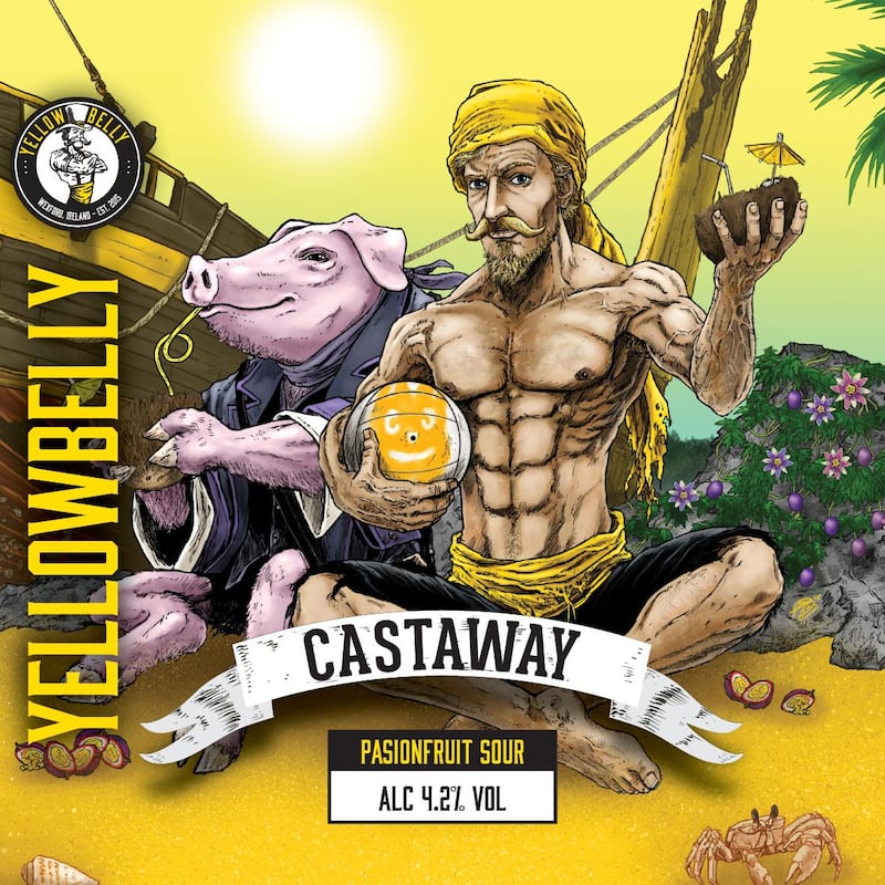
Since belly-flopping on to the scene in 2015, Wexford’s Yellowbelly Beer has established itself as one of the country’s leading craft breweries. In that short space of time, they have released over 200 beers, a prolific output for such a young operation. While no two YellowBelly beers are the same, one constant can be found across the range – the mischievous mustachioed man who adorns each and every label.
Aptly known as YellowBelly, he was conceived by the brewery's creative director Paul Reck. "We would never be happy with generic-looking labels so we created a character to represent our brand in YellowBelly," he explains.
Reck designs and illustrates the artwork for YellowBelly and each label features the eponymous character front and centre. What he's doing depends on the beer. For instance, the packaging for Belly Dance IPA depicts him throwing disco shapes that would make John Travolta blush while It's Elementary Session IPA features him wielding a violin in a nod to Sherlock Holmes. In other words, it doesn't take itself too seriously.
“We have fun with what we do and we want that sense of irreverence to spill over into our audience too,” he says. “We like to poke fun at ourselves and at popular convention. We create most of our concepts with our tongues firmly in our cheeks.”
As far as Reck is concerned, the branding works in tandem with the brewing of the beers. “We don’t think one could or should exist without the other,” he says. It’s all about facilitating a connection between the customer and the brand, he says. For that reason, the brewery has created a whole universe for YellowBelly. Not only does he exist on their branding, but he also stars in comics and games created for their website.
“Through this fandom we can connect in ways few other breweries can, offering an experience that long outlives the emptying of a glass,” he says.
And it seems to be working. Reck says they regularly get feedback from people delighting in their latest artistic output – a just reward for all the work he puts in.
“We spend a lot of time on our concepts and our labels because we genuinely care about how we are perceived by our customers,” he says.
“It gives us great pride to hear how bar staff and customers are just as excited to see the pump clip art of a new keg of beer as they are about tasting the contents.”
HOPFULLY BREWING
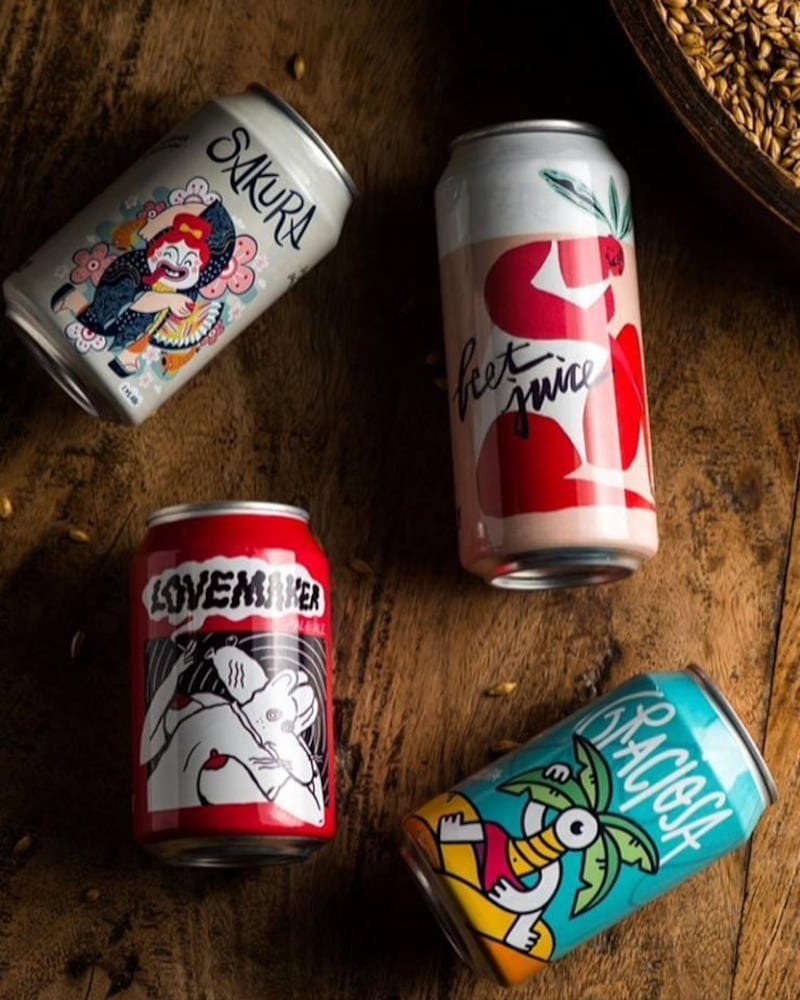
You certainly couldn’t accuse Hopfully Brewing’s branding of being subtle. Since starting production a few years ago, the Clonshaugh-based outfit have become renowned for their bright, vibrant designs.
“I have been into art my entire life so we thought that would be interesting to bring an artistic identity to all our beers,” says Vilson de Mello jnr, who co-founded the brewery with two friends in 2016.
Inspired by breweries such as Beavertown and To Øl, they decided to commission different illustrators to design their labels. With the help of their friend and art director, Bea Rodriguez, they scoped out artists on social media and made contact from there. Their four signature beers – Graciosa, Sakura, Beet Juice, and Lovemaker – showcase illustrations by acclaimed artists from all over the world.
Each are striking in their own way. Beet Juice depicts a beet in a swimsuit while Lovemaker features a mouse-like creature enjoying a post-coital cigarette.
“We usually send a brief to the artist with beer recipe and concept,” explains de Mello jnr. “We give them complete autonomy to design the label.”
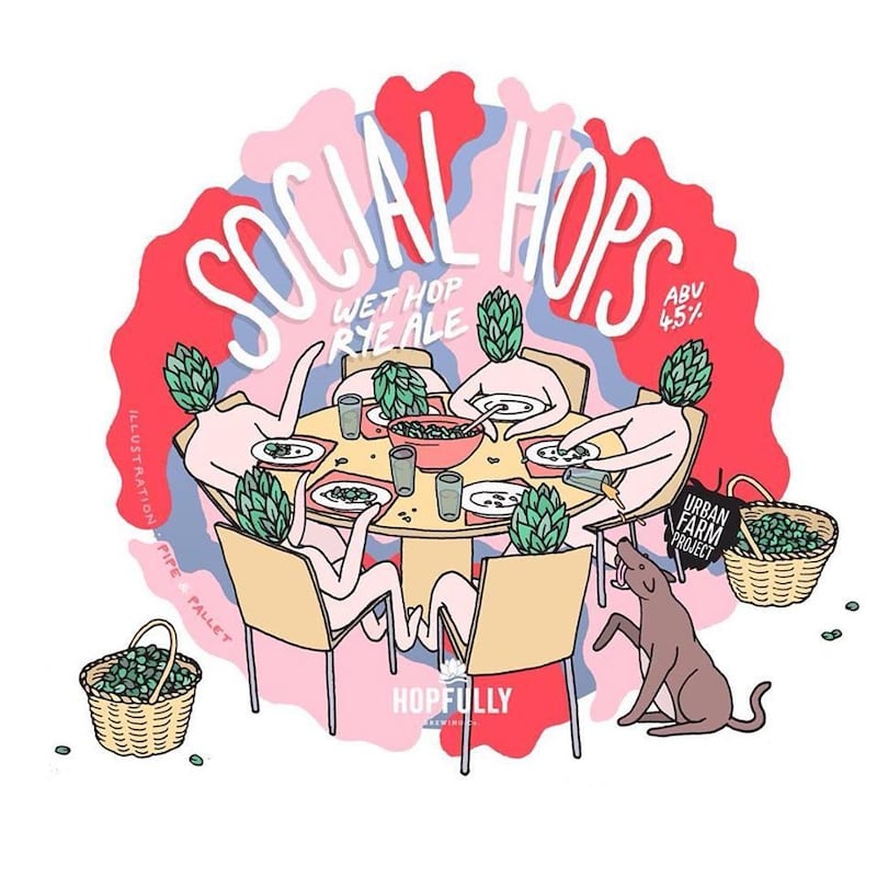
More recently, Hopfully Brewing commissioned Dublin-based illustrator Nathanael Roman of Pipe & Pallet to design the label for their latest brew, Social Hops.
“I was doing gig posters and album covers for bands when the lads first approached me to commission a poster for an event they were holding,” he explains. “Shortly after that they asked me if I’d be up for collaborating with them on a beer label. At that moment I was sitting at The Pav drawing on an unremarkable can of cheap beer so naturally I was on board.”
His label for Social Hops is a playfully literal interpretation of the beer name – it depicts a number of human bodies with hops sprouting from their necks sitting around a dinner table.
For Roman, the symbiotic relationship between brewers and designers makes perfect sense. After all, they have a great deal in common.
“I believe craft brewing and visual arts go hand in hand because they both chase the same thing,” he says. “They are both creative processes fuelled by passion and so it only makes sense to work together.”
WHIPLASH BREWING COMPANY
Based in Wicklow, Whiplash began life as a side project for Alex Lawes and Alan Wolfe. Both men were working with Rye River Brewing Company when they started renting tanks and cooking up small batch releases. What started out as a hobby quickly developed into something more serious.
“The consumer feedback forced our hand, really,” says Lawes. “We decided to take it full-time.”
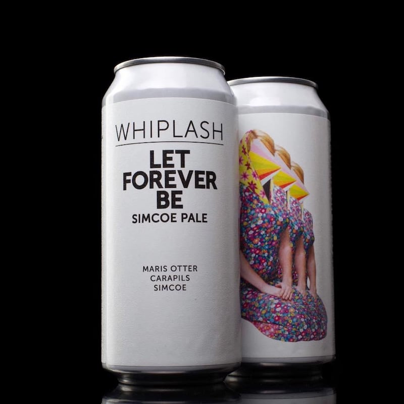
Since launching less than twelve months ago, Whiplash has acquired a reputation for its singular artwork. Each can features a mixed media collage on a white background designed by Lawes's partner, the artist Sophie De Vere. The aesthetic was developed in response to what Lawes saw as lazy, uniform beer branding.
"I just find it a bit contrived," he says of mainstream beer marketing. "It's generally the same four or five primary colours. I was thinking, 'This is kind of bordering on visual pollution when you walk into a shop'. It was kind of like in Blade Runner where there's so much neon signs all over the street that everything starts to blend into one and you can't pick anything out anymore."
With Whiplash’s minimalist packaging, he wanted to give the consumer’s eye a break while also offering a platform for De Vere’s work. He was also keen to avoid the sexist trappings of beer marketing that have plagued the industry for so long in favour of doing something “a bit more noble with the can space”.
When it comes to naming and branding Whiplash’s beers, the team will typically go through their playlists and pick a song name to apply to their latest concoction. “It’s just a nicer way of doing things,” says Lawes. They then provide De Vere with the song name and let her work her magic.
For example, their latest beer is titled Let Forever Be, inspired by The Chemical Brothers song of the same name. De Vere's artwork for the beer features the same image multiplied three times in an homage to the song's surreal, prismatic music video, directed by Michel Gondry.
“Those things click into place quite easily sometimes,” says Lawes.
Lawes says the cans have struck a chord with customers to the point where they can be considered collectors’ items.
“You see people mailing us, ‘Do you have any spare labels? Is there anything you can send me out?’ That’s cool.”